Web Components Wednesday (WCW) blog series is created for two purposes: introducing easy-to-use components and educating people on the concept of Web Components. All the WCW blogs can be found here.
 As web developers, we concern so much about how to load and show content faster on the website. We can speed up loading using techniques like minifying files, lazy loading media or upgrading your server. While those methods might seem straightforward but they usually are time-consuming and costly. Instead of investing big money in those jobs, you can make use of UI elements like loading placeholder and progress bars. This process is called latency compensation.
In this blog post, I will introduce some of those UI components mentioned above that can signi significantly your viewers’ satisfaction.
Animated-content-placeholder by Collaborne

Getting the inspiration from Facebook placeholder, animated-content-placeholder is an effective but lightweight and easy form to make your users wait while loading the page. The whole component is one animated div with many maskings. Those masks make sure that the placeholder resembles the layout to an extent so that it can result in a visual stimulus, thus please your audience more. As always, check out the demo for more instructions on usage.
Tk-loading-backdrop by butterfly

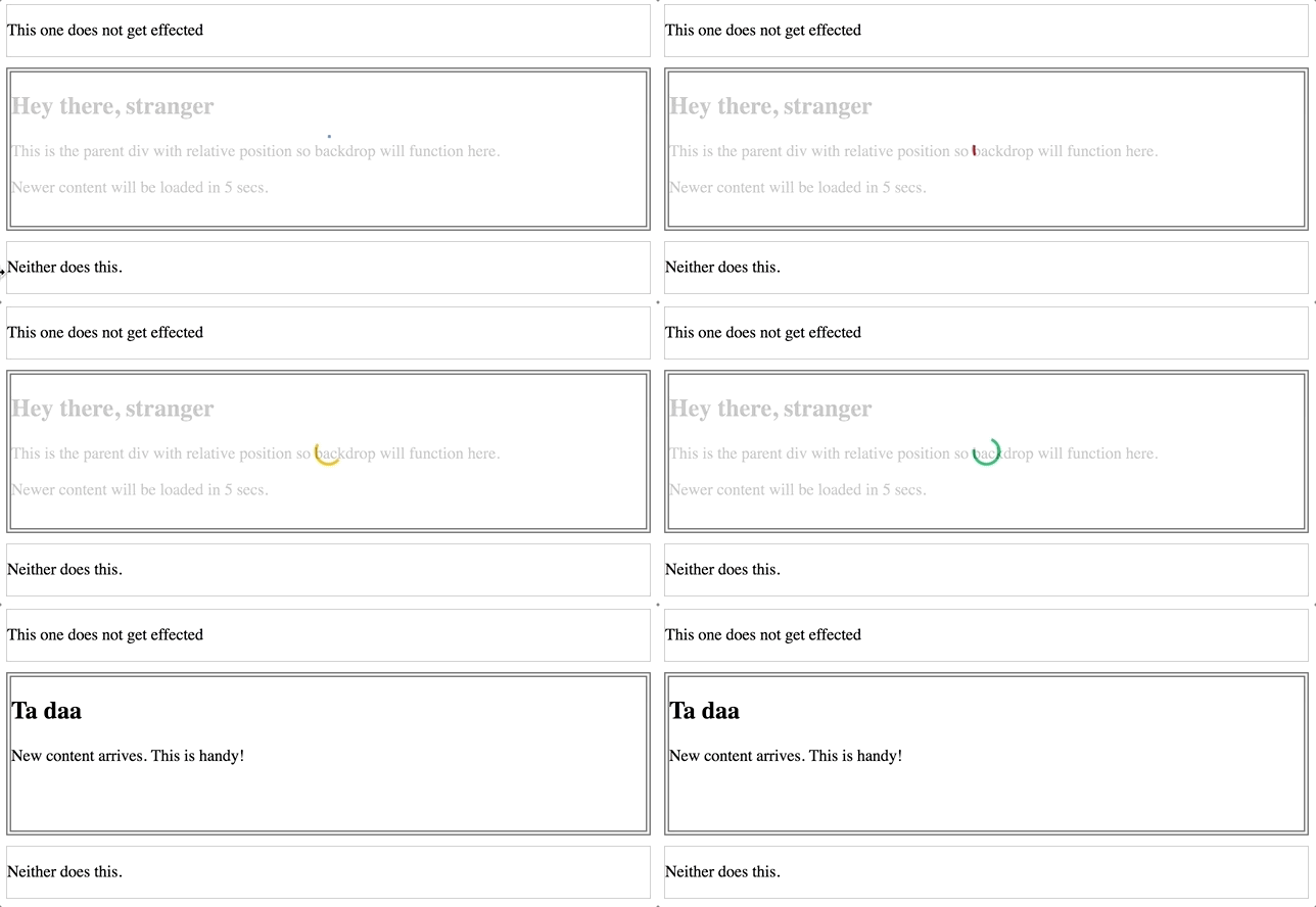
Tk-loading-backdrop is a handy way to keep your users accompany by displaying a backdrop over the desired part. Since the old content will not disappear and just get dimmed by the indicator, it makes the transition more transparent and less immediate. You can turn on and off the backdrop easily, as well as show the new content with a few simple lines of Javascript. I have included a pragmatic sample manifesting how you can achieve that.
Paper-pulsating-progress by Collaborne

With great design comes great result, paper-pulsating-progress stands out with its creative animation and form. You can play around with the color, so choosing one that aligns with your website palette. We guarantee these three dots can help so much in entertaining your viewers during loading time.
Progress-bar by samuelli

A lightweight, vanilla web component with no dependencies, progress-bar makes sure it always finishes first in the loading race. Being small as it is, progress-bar still opens various rooms for customization, including the color, animation duration and delay time. The loading goes forever as long as the property active is still in place, for a smooth finish, use the disabled property.
Compatibility table
The table below will shortly summarize the components’ info and compatibility on multiple platforms. Browsers include Chrome Canary, Safari Tech Preview, Opera, Firefox Nightly, Edge and Internet Explorer 11.
| Component |
Library |
Mobile |
Browsers |
| animated-content-placeholder |
Polymer^2.0.0 |
✔ |
C,S,O,F |
| tk-loading-backdrop |
Polymer^2.0.0 |
✔ |
C,S,O,F,E,I |
| paper-pulsating-progress |
Polymer^1.4.0 |
✔ |
C,O,F,E |
| progress-bar |
VanillaJS |
✔ |
C,S,O,F,E |
Final words
Keeping your viewers patient while the site is doing magical stuff in the backend is, if not, considered the most crucial part of maintaining it. Using these components, you can positively impact on viewers’ feel and satisfaction.
Click here for more awesome web components