| Vaadin 6.8.x |
Vaadin 7.x |
|
| Maven Artifact Id |
vaadin-charts-vaadin6 |
vaadin-charts |
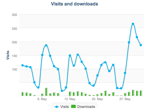
Implementing the charts is as easy as ever. To test it in real life, we updated an old web reporting application made with Vaadin 6 to use Vaadin Charts (it was using a custom Flash based graph library). The results look even better than before and we don’t need any browser plugins anymore!
Introducing new chart types
In addition to Vaadin 6 support, this release also features a couple of new ways of visualizing data. Here is a quick tour of the new chart types:
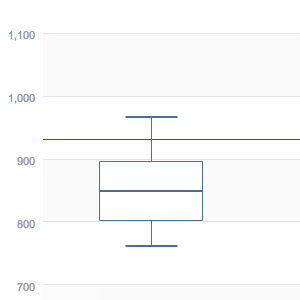
Box Plot
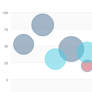
Bubble chart
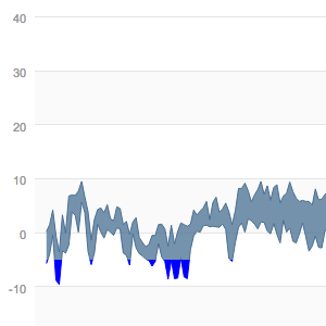
Color threshold
Color thresholds allow you to give a specific color to data below a certain value. This gives quick visual feedback for monitoring to make sure values stay above (or below) a certain threshold value.
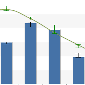
Error Bar
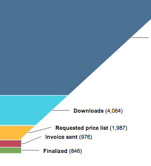
Funnel
Typical in sales funnel visualization, the funnel chart gives you a way of presenting data sets that show some kind of causality or conversion.
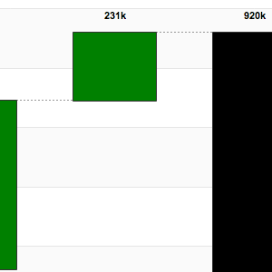
Waterfall
With waterfall charts you can present the cumulative effects. For example income and expenses, or other similar data. A point can either be positive or negative, an intermediate sum or the total sum.
Upgrade your charts
Take advantage of the latest features and start your free Vaadin Charts trial from Vaadin Directory. Even if you are not purchasing immediately you can try it out for free. There is a good chart index and source code examples available to help you to get started.
And last but not least: let us know what you think. Post to the forum or comment directly to this blog post.

