Vaadin Directory has served us well as the place to look and install extra components for Vaadin. To better serve the open source community and developers, we just made a complete overhaul of Directory’s user interface to focus on ease of use - and of course to modernize the look and feel.
Searching for the right component
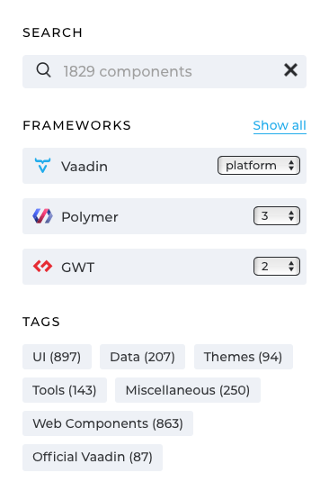
The search page is built all around the search box, version filtering, and categories – so you can more easily find the component you are actually looking for. When you already have an application, the framework compatibility usually comes handy to choose first, but of course, you can also just browse through all 700+ components and see if anything fancy pops up.

Does this component do what I want?
Talking with many users, they’ve told the component demos and screenshots are the two things to check first. On the component details page, you can most prominently find the component demo link, activity details along with component screenshots and an overview. Code samples, ratings, and reviews are important when choosing among similar components and you can find them on their dedicated tabs.

Install and use it
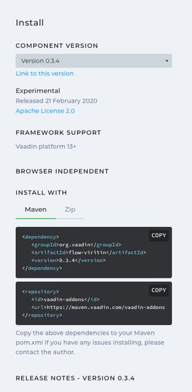
When you find the component you are interested in, check the sidebar. We wanted to keep it solely for technical compatibility and installation instructions. You can choose the version, check the framework and browser compatibility information and find the actual installation details to copy-paste.

That's it. Give it a try! We’d love to hear your feedback on everything in the comments below.
P.S. For the latest in Directory, please follow us on https://twitter.com/vaadindirectory

