Theming and Styling
By default, Vaadin Designer shows your design using your application theme, so usually what you see is really what you get. You can also use the theme dropdown to apply a specific theme.
Theme Based on Valo
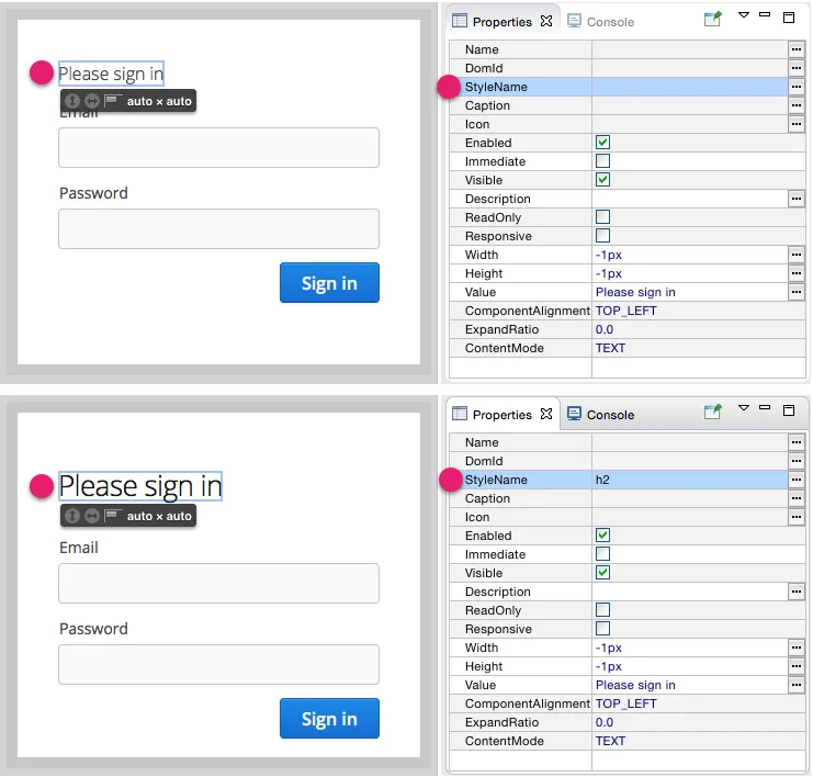
If your theme is based on the Valo theme (the default), you can make use of the built-in Valo features. For example, if you can apply the built-in component styles by adding the appropriate stylename. You will see the result instantly.

You can also modify the Valo settings by changing the parameters in your theme file (see below for more information about the theme file). See "Valo Theme" for information about Valo theme.
A Valo example that you can copy into your theme can be found at Github Gist.
Theme File
In a regular Vaadin application, you theme will be located in the VAADIN/themes/<themename> folder, in the <themename>.scss file. This is where you can modify Valo settings, and add you own styles.
When you make changes to this file (and save it), Vaadin Designer will notice and update the design, which is very convenient when styling your design, or generally when learning to make an application theme.
You can apply global styles (such as to style all buttons), or scoped as you wish. You can "scope" styles by specifying one or more space-separated style names in the StyleName property, then matching to that in CSS/Sass.
Source code
/* Applies to all buttons */
.v-button { ... }

/* Applies to components having the stylename "mybutton" */
.mybutton { ... }

/* Applies to all "mybutton" components within a "mydialog" layout */
.mydialog .mybutton { ... }
If you use the same stylenames in multiple designs, the same styles will be applied, allowing you to create a consistent look.
If you do not want some styles to apply to other designs, you should give your root layout a unique stylename (for instance matching the design name), and prefix all styles with that.
Source code
.usereditordesign .mybutton { ... }