Web Components Wednesday (WCW) blog series is created for two purposes: introducing easy-to-use components and educating people on the concept of Web Components. All the WCW blogs can be found here.
 Toast notifications, pop-up notifications, bubbling messages or toasters! You get them everyday, from the new email pop-up, to the system messages to update your OS or a compilation error in your IDE. The essence of a toast is its non modal, unobtrusive styling, which is super useful in those kind of informative situations. In this blog, we will introduce to you four great web components which can handle your toasts like a boss.
Paper-toast by PolymerElements
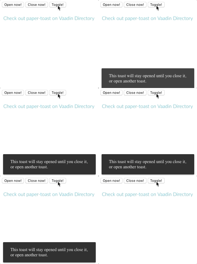
 Paper-toast is a Material design toast notification, with the embedding of paper-button and a cool in-n-out transition. You have plenty of ways to work with the toast, for example: the timer can be defined as a specific duration or indefinite, as in a persistent toast. The block can be styled freely using custom CSS properties.
To close a toast, you may put in a paper-button inside and set the onclick event to <toast-id>.close(), you may press Esc or you can even click outside of the region, if noCancelOnOutsideClick is set to false. Note that all of these behaviors can be controlled easily using the custom attributes. For an handy extra, set the attribute fit-into to the id of the desired div so it will fit nicely in the bottom of that div.
App-toasts by jifalops
 App-toasts is an extension to paper-toast with more functionalities to it, to mention a few, swiping to close or having different themes for various purposes (
success, info, warning, error) with all of them being stylable.
Here is the list of important attributes: duration (0 or negative for indefinite), actionText, showCancel, disableSwipe, fitBottom (equivalent fitInto, except that you set it to true/false). And last but not least, use these attributes, onAction and onCancel, to call functions you want upon users pressing the button or cancelling the toast.
Prism-announce by Prhythm
 Prism-announce comes with three types of message display containers,
 prism-announce-notification, prism-announce-toast and custom type. The main difference lies in the styling and how do you construct the structure of the notification. In order to use, you need to input a pair of prism-announce first, then comes the template tags. Inside here, you can either choose to use prism-announce-notification, prism-announce-toast or your own custom template.
You may change the position of the announcement by applying these attributes top, bottom, left, right or snackbar. An example is top left.
Vaadin-notification by Vaadin
 As a part of Vaadin components, vaadin-notification makes use of the Lumo elegant and modern styling. And it’s totally possible to customize it, even though I don’t recommend doing so as if you are building a Vaadin web app, as these Vaadin web components have been designed carefully to match each other properly.
Just like prism-announce custom way, you may also input a pair of template tags with the HTML you want in vaadin-notification. Then set the duration to either less than zero or more than that to switch between persistent/impersistent mode. You can have 9 different ways to place the container using the attribute position, such as bottom-stretch, top-center, middle.
Compatibility
The table below will shortly summarize the component info and compatibility on multiple platforms
| Component |
Library |
Mobile |
Browsers |
| paper-toast |
Polymer^3.0.0 |
✔ |
 |
| app-toasts |
Polymer^2.0.0 |
✔ |
 |
| prism-announce |
Polymer^2.0.0 |
✔ |
 |
| vaadin-notification |
Polymer^3.0.0 |
✔ |
 |
Final Words
With all four toasts having different styles and feels, it’s left to you to choose which one suits your app best. Which one do you like best and why? Share us thoughts in the comments.
Click here for more awesome web components