Web Components Wednesday (WCW) blog series is created for two purposes: introducing easy-to-use components and educating people on the concept of Web Components. All the WCW blogs can be found here.
 Have you ever wondered why it is called an “Accordion” element? The answer is simple, both the element and the musical instrument consist of sections, which can be expanded. What purpose do they serve? In short, an accordion enables users to present information in a limited amount of space (a FAQ page, a menu).
This article will introduce smart-accordion, a great accordion web component, along with the usability of the element. Without further ado, let’s check it out.
Too much text? Smart-accordion is the solution
If you have visited any FAQ page of any company, there is usually a long wall of text for many questions. The most practical way would be to use an accordion. For example, check out Microsoft, Adidas, and Vaadin.
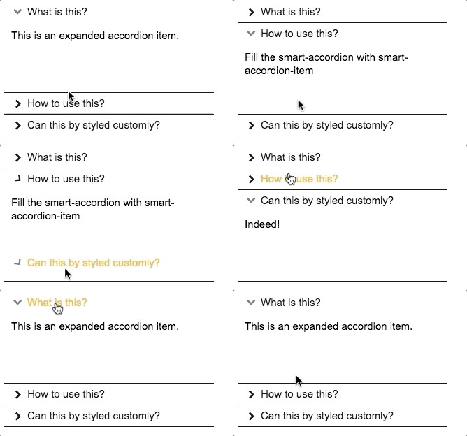
Smart-accordion is super efficient when it comes to saving space and most importantly, you can still present the crucial information (question, key topic, categories, etc.). One can set a pre-expanded section by applying the attribute expanded to the desired item.
...
...
One can expand at a time, or many
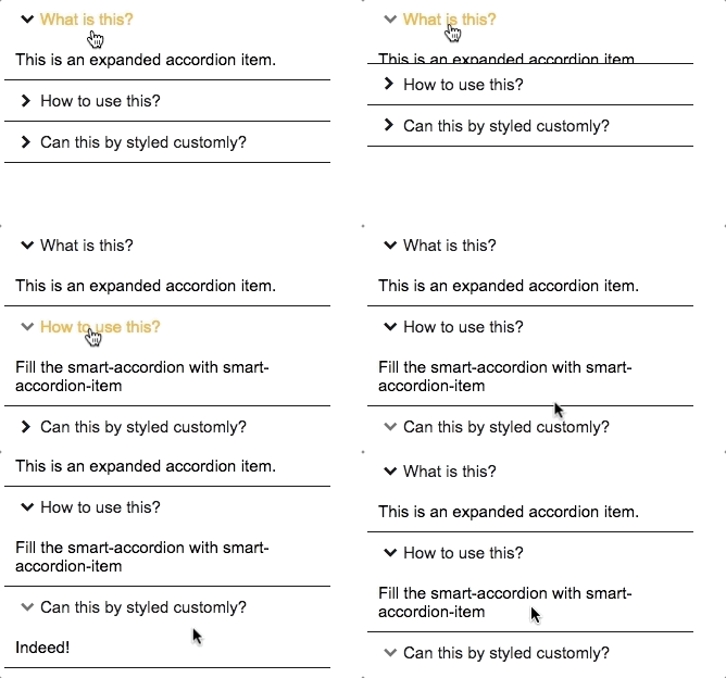
Somcoe accordions are designed to have one open item at a time, like a menu or course topics; while some are preferred to have multiple exposed. Using the attribute xpand-mode, you can achieve this easily.
There are several options, which you can choose: single, singleFitHeight, multiple, toggle and none. Only the multiple option allows you to expand several items at once. Single and singleFitHeight are close to each other, the only difference is the location of the vertical scrollbar, if the item height is greater than the accordion height. Toggle enables you to collapse all items, which you can’t achieve with any other mode. With none, no items can be expanded or collapsed.
*Shhh, did I tell you that this component can be controlled with the keyboard, as well?
Customizations are the key
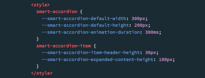
 Craving for stylings? Smart-accordion provides basic CSS custom properties that may serve your “appetite”. The list below will manifest what properties there are and to which element you need to style it under.
Smart-accordion:
--smart-accordion-default-width> The width of accordion > default: 200px--smart-accordion-default-height> The height of accordion > default: 200px--smart-accordion-animation-duration> The duration of the item scrolling animation > default: 200ms
Smart-accordion-item:
--smart-accordion-item-header-height> The height of the item section > default: 0px--smart-accordion-expanded-content-height> The height of the expanded section
Compatibility
The table below will shortly summarize the component info and compatibility on multiple platforms. Browsers include Chrome Canary, Safari Tech Preview, Opera, Firefox Nightly, Edge and Internet Explorer 11.
*For a more thorough doc, head to the Smart Element documentation.
| Component |
Library |
Mobile |
Browsers |
| smart-accordion |
Smart Element |
✔ |
C,S,O,F,E |
Final Words
Among plenty of excellent accordion components, only smart-accordion is still actively maintained. It’s easy to make a component, but to sustain and develop it further requires dedication from the author, and the job is not always pleasant.
That’s why we have created a community, Vaadin Directory, where people can publish, review and make feature requests to other people's components. We believe in a community-driven place, where all of you will help growing and improving it.
Contribute to Vaadin Directory now