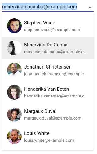
The Vaadin Elements team has just released a new update for <vaadin-combo-box> that enables custom item templates for combo box items. With custom templates, your combo box can consume the items array to display more complex HTML, such as including an index, adding an image, displaying multiple fields from the item data, or simply making the item bold or italic. Custom templates also allow you to display multiple fields from the data items, if you set the combo box’s items property to an array of objects.
For example:
<vaadin-combo-box items='[{"label": "Hydrogen", "value": "H"}]'>
  <template>
    [[index]]: [[item.label]] <b>[[item.value]</b>
  </template>
</vaadin-combo-box>
This will create a combo box where the items will be listed as:
1: Hydrogen **H**
Custom styles for item templates
With item templates, you can also style the displayed item. To do this, you need to create a new custom element with its own styles and template. You can also use any existing elements, such as <paper-item>, which is a natural fit for combo box items. The <paper-item> element can be easily used for this purpose.
For more information, see our docs page for Styling Combo Box Items with Custom Item Element.

Focused and Selected
There are several new variables you can bind from within the item template to further customize the displayed item. These variables are index, focused, and selected.
indexdisplays the number index of that item, as shown in the first example above.focusedis true when the user is focused on that item, such as with keyboard navigation.selectedis true when the item is the selected item for the combo box.
Learn more about <vaadin-combo-box> at the Vaadin Elements page.