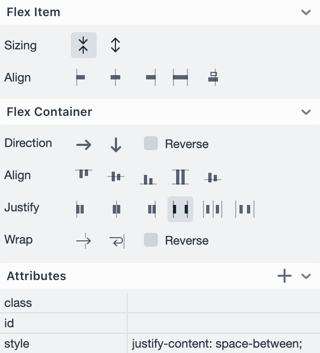
Vaadin Designer 4.3.8 makes laying out your Vaadin views a whole lot more visual. Previously, you had to know and enter the CSS for your views. Now, you can edit your flexbox layouts using simple controls in the properties panel. You will also learn flexbox in the process!

The main building blocks for flexbox views are Vaadin vertical and horizontal layouts. By combining and nesting these layouts, you can achieve virtually any layout view you need. In fact, you can use the Designer’s flexbox editing capabilities with any flex container and item.
Let's take a look at a couple of examples.
- First, we create the base layout for a view. There's a vertical layout at the root of the view.
- Next, we add two child layouts in the base layout: one for the top bar, and one for the content area.
- To stretch these layouts across the view, we set the vertical layout’s align property to stretch.
- To make the content area take up all the available space, we select grow in Flex Item properties
Aligning components is now super easy.
- The top bar has a label and a menu button.
- To put the label on the left, and the button on the right, we set the horizontal layout’s justify property to space between. That pushes the components apart against the edge of the view.
- We center the top bar components vertically, by setting the top bar’s align property to center.
- The content area has a text area (that takes up most of the space), a checkbox, and a couple of buttons.
- The checkbox is aligned in the middle, and the buttons at the left and right edges of the view.
You can achieve all this with only a few clicks using the new flexbox controls.
To learn more about working with flexbox in Designer, please take a look at our instruction video and documentation. And of course, try it out for yourself!
