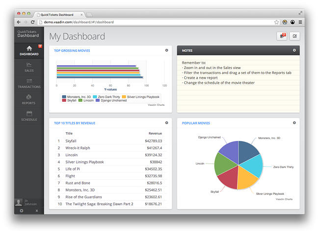
We’re releasing our new Vaadin demo application, QuickTickets Dashboard, to the public today. It’s an application that I’ve been planning to create for some time and I hope that you find it a useful demonstration of what you can do with Vaadin.
Let me discuss a bit about the motivation for the demo before going for the meat, its design.
Background
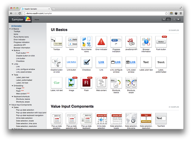
For quite a long time now, the Sampler has been the main demo application for Vaadin. Originally designed sometime during '07–'08, when Vaadin was still called IT Mill Toolkit, it also had the purpose of being the main source code example repository for developers.
Sampler has fulfilled its part in showcasing Vaadin very well, even though some of the core features are missing from the examples. However, as a demo of what Vaadin is generally intended and used for, it doesn’t really have any value. We have created MobileMail as the main mobile application demo for the Vaadin TouchKit add-on, but we have been lacking in the desktop application demo department for a very long time.
Certainly, we’ve had the Address Book application, but that was designed only as a coding tutorial, not so much as an example of an application that could be accomplished using Vaadin. And let’s face it – it looks quite bad, even though the Runo theme tries its best to make it pretty. And also, it only reflects a very limited set of features of what Vaadin has to offer (no drag’n’drop for instance).
The Vaadin UX
Even though Sampler is currently being redesigned and reimplemented, we’ve had ideas about making a more “real” demo application before. Those ideas haven’t materialised, mainly because of other priorities.
You may have heard the name “QuickTickets” before. It was the fictional name for a movie ticket selling company in our Vaadin scalability study. You can learn about the scalability study from the Dock magazine or the blog post.
So, we thought it would be suitable to continue with the ticket sales theme and consider what an administrator view for the service would look like. Such an application is more in line what Vaadin is typically used for, unlike the front-facing ticket sales site we benchmarked in the scalability study. And what would be more contemporary than a dashboard for management personnel ;).
The initial design was drafted pretty quickly, and it’s mostly what ended up in the final application as well. It was a very blurry-around-the-edges kind of design, and a lot of things ended up being designed ad-hoc when I was implementing it.
The main purpose of the application is to give an idea how a typical Vaadin application might look and feel like to use, and also highlight some of the more advanced Vaadin features. I hope you like it – and if so, you’re welcome to borrow any ideas from it.
Rock it out!
Go and try it out yourself. Feel free to click/drag/poke at anything, you can’t cause any damage with any actions.
There are a few of things you should try out:
 The sign in screen is there just to note that most Vaadin applications implement some sort of authentication. You can try giving it any username and password to see a neat little notification about wrong credentials. Use empty values to actually access the application.
 In the “Dashboard” view, you can try resizing your browser window and see how different parts of the UI, even the charts, scale accordingly in real time. You can also try the browser zoom (full or text zoom) and see everything scale nicely.
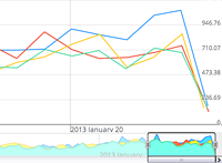 The “Sales” view features the Timeline add-on (now part of the Vaadin Charts add-on), which allows you to browse huge continuous data sets. You can use the selection area at the bottom of the view to change the time range and move through the data. The actual demo data is still a bit scarce, but we’ll implement more fine-grained data in the future, so you can zoom in and out more.
Use the combo box in the top area to add more data sets to the timeline (there are currently only four colors specified for the data sets, so after four the data gets a bit hard to read).
 The “Transactions” view lets you scroll through a large amount of tabular data, lazy loaded similarly as with the timeline. When lazy loading the data, the browser only gets the part of the data which is actually visible on the screen, not all of the thousands of items.
You can filter the rows by country and city using the filter field above the table, and then select multiple rows from the table and drag them onto the “Reports” tab to create a new report out of those items. The same can be accomplished by clicking the button in the top right corner or by using the context menu in the table.
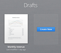 In the “Reports” view, you can open a pre-created draft report and edit that, or create a blank report. The editor lets you drag three different types of items onto the canvas/paper (an editable text block, a pre-created table, and a pre-created chart). You can also rearrange the items on the canvas by dragging them around.
You can also click on the title of the report to edit it. The title is updated to the tab caption as you type it.
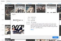 Finally, the “Schedule” view lets you use the Vaadin Calendar add-on to rearrange the schedule of a movie theater. There are no restrictions on how you can rearrange them, so you could drag all the movies into one day, for instance. You can click on the events to see their details.
A peek at the back-stage
The application is built using Vaadin 7 RC1, which allowed me to use all the great new layouts and Sass features that are most welcome for a theme developer like myself. Adjusting white-space and aligning components was always kind of tedious in Vaadin 6, but that’s definitely not the case with Vaadin 7. You can throw pretty much any CSS at the layouts and they work as you’d expect. Also, the lighter DOM structure and cleaner CSS class names give you plenty of hooks to which you can apply the styling easily.
I should probably also mention that by leaving the support for our beloved IE 6 & 7 behind in Vaadin 7, you can now focus on the actual look of the application and not on CSS tricks and hacks.
When I started implementing the demo during the first beta release of Vaadin 7, the Sass compiler implementation in Vaadin was at its early stages at that time. The demo worked as a kind of a proving ground for the compiler. I stumbled upon many issues during the development, most of which are now happily resolved.
Because of this, I didn’t end up using as much Sass as I would have wanted to (didn’t have time to refactor the stuff I developed early on). Nevertheless, sprinkling even small bits and pieces of Sass shows the power and flexibility it offers in styling Vaadin applications – the border-radius mixin alone is enough to save a couple of dozen lines of CSS to write. I can’t really imagine going back anymore!
As I already pointed out, the app used a couple of Vaadin add-ons, on top of the vanilla Vaadin:
- The Vaadin Charts add-on for those beautiful interactive and animated charts
- The Vaadin Calendar add-on for displaying the movie schedule
- The CSSInject add-on for dynamically changing the background images for the movie events in the calendar
The movie data is fetched using the Rotten Tomatoes API, the country and city names are stored in a text file, and all other data is generated randomly.
The application supports all the browsers Vaadin 7 supports. Some of the CSS won’t work in older browsers, but the application degrades quite gracefully in those situations. As a side note, I can count the browser specific CSS fixes on the fingers of one hand, which really gives you an idea how pleasant it is to work with Vaadin and modern browsers.
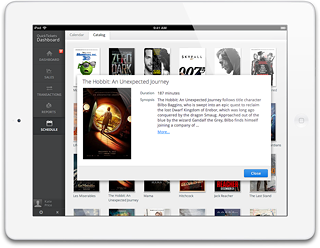 Even though the application was designed purely for desktop use, you can try it on a new iPad and see that it works just fine without any modifications.
The after-party
In all of its glory, this demo isn’t without issues. There are a couple of things that are still bugging me and things that I want to clarify to all of you.
In my previous blog post, I explained a bit about the process of the upcoming Vaadin 7 theme and its design. The demo application which I mentioned there was indeed QuickTickets Dashboard. Even though the demo has been a playground for ideas about the upcoming theme, none of it has been set in stone yet, so do not expect the Vaadin 7 theme to look anything like this application. It might look a lot, a bit or nothing like it, I give no guarantees.
This project has been pretty much my solo effort (apart from the core and add-ons and testing), so there are possibly some bugs lurking around the corners. Don’t panic if you encounter one – instead, report it, and I will be plenty happy (you can use the comment section in this blog).
And because of the ad-hoc design, as I mentioned earlier, the use cases are a bit bogus and unrealistic, and the application flow isn’t completely what I hoped it would be. Plenty of ideas were left unimplemented, which I hope to correct in the next iteration.
As this is an example of a Vaadin user experience, not in coding style, I did not put the source code available. I might share it later on if I can find time to clean it up. (Source is available now, see below)
There you have it. Show it to your friends and family to impress them and show what a Vaadin application can do in the browser, without any browser plugins. Comments and questions are again welcome, just add yours below.
PS. This is also a good showcase on what kind of apps the Vaadin team builds for their customers. If we could be of any help, please be in touch.
Update 2/20/13
