Vaadin Designer templates allow you to reuse design patterns and skip some of the repetitive configuration you need to do when you create your application’s views. I’d like to share some guidelines on what templates are best for and what are the few things you need to take into account when creating templates.
How to create a template
Creating your own template is very easy. Any valid design file can function as a template if you store the declarative file (.html) to the special template directory: <userhome>/.vaadin/designer/templates. When you create a new design from a template, the content of the template is just copied to your project as a new declarative file and a new design Java file is created. You can find some templates from https://vaadin.com/designer. Designer 1.0.3 comes bundled only with very basic templates and it doesn’t have any automated way of finding and installing new templates. In the future versions the template handling will be smoother.
Benefits of using templates
You can think of templates like stored declarative code snippets that Designer allows you to use as a basis for a new design file. Templates are valuable for sharing design patterns and other visuals e.g. view layouts containing some regular content you don’t want to recreate over and over. Having a lot of useful templates is almost like having a nice reserve of useful code in your clipboard. In addition to that, it’s also useful in creating consistent end-user experience. The developer using a template doesn’t have to spend time on thinking what is the most user friendly positioning of UI components. Templates can also serve you as a way to define your company design guide.
The fact that a template contains only the declarative part and not any custom behavior makes it very different from an add-on. Let’s say you want to create a template for a confirmation dialog layout to save you from always starting from a blank canvas. Instead of drag-and-dropping and configuring all the components, you can just create a new design from a template. Of course you need to handle the click events and other logic by yourself, and there a proper confirmation dialog add-on might be much more valuable. That said, many times an add-on is a total overkill and may limit your possibility to customize the visual aspects apart from styling with CSS.
Guidelines
There are a few guidelines you should consider when creating templates.
-
Name your template with a descriptive name. Currently the “Create new design” wizard lists the templates only by name. If you have a lot of templates, you’ll appreciate templates having a descriptive name.
-
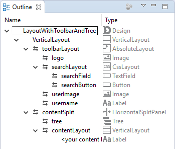
Name every component you think the template user might want to access and use consistent naming. Named components are extracted to the design Java file.

Example of naming components in design hierarchy
-
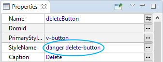
Use consistent style names to allow easier theming. Using style names from your base theme (most probably Valo) as much as possible allows the user of your template to redefine the styles easier. Always remember to include a component specific style name, too. E.g if you use a BUTTON_DANGER style for your delete button, add a style name like “delete-button” too.

Example of component style naming
-
Templates can contain embedded style definitions, but be careful if you embed CSS in your template. Maintaining the styles is cumbersome as you need to manually copy the definitions to your template. Never ever use Valo parameters in the template embedded styles. Those parameters will bleed to your application theme and probably don’t behave as you expected. If you need to modify Valo parameters, do it in your application’s custom theme. Even consider redistributing a custom theme alongside your template instead of embedding styles into the template.
-
Make sure your template works with different screen sizes as you expected. Designer makes it easy to try different screen sizes, as you can change the canvas size by dragging the canvas border rectangle or selecting from presets. Using the responsive layout design, you can help the end-user to get the best experience on every screen size.
Template example

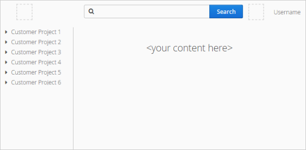
As an example, I created this little template for a pretty simple application layout. Let’s go through how this example follows the previously listed guidelines. You can download the template from here.
-
Name of the template is LayoutWithToolbarAndTree. Maybe the name is a bit long, but at least it’s descriptive.
-
Every component in this template has a name so that the generated design Java file will have a variable for each of them e.g. search button is called searchButton and it’s inside a layout called searchLayout.
-
Every component has at least one style name e.g. search button has style names “primary” (from Valo) and “search-button”. This way you can either style all of the primary buttons or just the “search buttons” in your application theme.
-
The template contains very little embedded style definitions. The only styles present are responsive breakpoints for different width ranges and that blue background for those placeholder components and resources. Those styles are still quite maintainable. No Valo parameters are present, either.
-
The toolbar in the template is responsive – the width of the search field changes based on the available toolbar width. This is achieved with embedded style definitions like this:
  .toolbar[width-range~="950px-"] {
    .search-layout .search-field {
        width: 450px;
    }
  }
Overall the template follows the previously mentioned guidelines quite well. Feel free to use the template example, if you find it useful.
What do you think about these guidelines? Did I forget to mention something important? Please share your own ideas, experiences or even completed templates in the comments section.
