Enterprise UX can be defined simply as UX for workplace apps. This refers to the apps that help employees run critical business processes for example in factories and financial and medical institutions. Internal apps used only in the workplace for timekeeping, compliance, and other organizational practices fall into this category.
On the flip side, consumer apps are simpler apps designed to help accomplish specific user needs, for example, social media, food, and taxi ordering apps.
Enterprise apps are often characterized as being aesthetically dull, old, and cumbersome to use as opposed to consumer apps which are typically intuitive and aim for maximum user satisfaction. There is a need for simplification and user satisfaction even in the most serious enterprise applications. Ultimately, good UX is good UX regardless of whether it’s in the consumer or the enterprise space.

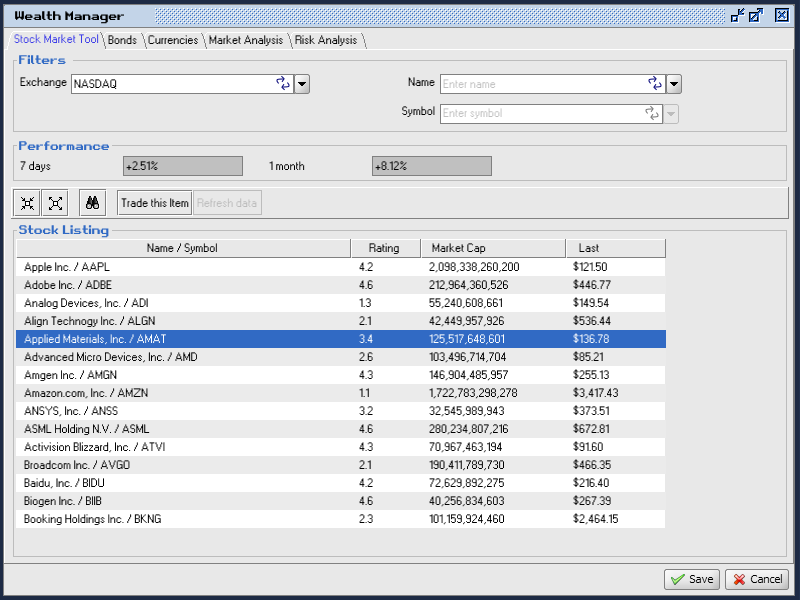
Figure 1: Original UI for Wealth Manager
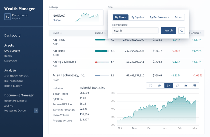
Figure 2: Updated UI for Wealth Manager
Users have gotten a taste of good UX from the apps they use every day and in a general sense appreciate simplicity even in complex use cases. No one likes to deal with UIs that are difficult to use with very unconventional workflows. Nowadays, there is a push towards simplifying even the most complex enterprise apps for a good reason.
Missed our recent webinar: How to build enterprise apps with the user in mind? Watch it on demand!
The pitfalls of poor UX in the enterprise
The pitfalls of poor UX in the enterprise are too significant to ignore as they could lead to financial losses or even threaten lives. For example, Citibank has been receiving media attention for a mistake caused by one of its app’s user interfaces in recent years; Citibank was acting on behalf of Revlon to send out interest payments to creditors totaling $7.8 million. However, the subcontractor tasked with making the payment sent out a principal amount of $900 million instead. This was signed off by two other people who couldn’t catch the mistake either.
Another example that has been making the rounds in Finnish media was the Apotti System, it is a Patient Record System used in some hospitals in Finland. Doctors have reported frustrations in care partially or entirely caused by the system. In at least one instance, the medicine recommendation function which is particularly complex has contributed to the wrong medication causing a severe reaction in the patient.
Even though workplace apps are used to handle important tasks and financial transactions, they are still mostly perceived as being crappy. Here are a few contributing factors to why that tends to be the case:
1. Complexity
These types of apps are meant to accomplish complex tasks, as such, they often consist of large forms, diagrams, and charts, contain large amounts of data with sorting and filtering capabilities, and use domain-specific terminology. There is a high barrier to entry based on the idea that they are going to be used by professionals who need to undergo training as opposed to consumer apps that can be downloaded by anyone from an app store.
2. Mandatory
Company management decides the software used by employees, as such, there is hardly any end-user input in the software development or procurement process. Companies generally favor other considerations like cost, security, privacy e.t.c. Unless the company is particularly enthusiastic about employee experience, the UX of the apps they use is given a lesser priority.
3. High sunken cost
Many workplaces have very specific workflows that require custom solutions, there isn’t an off-the-shelf solution available that caters to the specific need of the workplace. Custom solutions are rather expensive to build and maintain. In some cases, these custom software also go hand-in-hand with custom hardware. The cost creeps up with hours put into training, documentation, etc.
Naturally, these types of custom software would be used for a long time even as technology evolves and they become relatively old. Because they are too expensive to modernize.
4. Lack of competition
In the consumer space, users are spoilt for choice; if they don’t enjoy the experience of using an app, they can go to the app store and find an alternative, unlike employees using enterprise apps. At best, employees develop workarounds to complement their work if the software they have to use is lacking. On a general level, Enterprise UX hasn’t reached the same level of maturity as consumer UX yet.
Poorly designed apps negatively affect the workplace in a variety of ways. For example, they can result in:
- Dissatisfied employees. Inadequate tools slow down and frustrate professionals. Ultimately, they may burn out and leave for better work environments. Especially in these past few years, there have been radical changes in the workplace that require employees to put extra focus on employee retention.
- Costly errors. Some domains are sensitive, and mistakes can be expensive or even life-threatening. A well-designed app should anticipate errors and help users recover from them
- Low customer satisfaction. Bad apps cost time and become a bottleneck to smooth organizational operations. This results in poor customer satisfaction.
- High training and support costs. Apps that are difficult to use require training to be used efficiently. They are also more error-prone and users require support more often.
What goes into building good enterprise UX
At Vaadin we believe that workplace applications should not suck. The root of the problem with workplace applications is complexity and the core value of Vaadin is simplicity. Here are a few ideas to tame complexity and build a great UX for workplace apps:
1. Think about the users
Employees are sometimes oblivious to the dangers of poor UX and need to be enlightened about the ROI of well-designed solutions. Advocating for an employee-centric organization and developing empathy for them with regards to their use of software leads to improvements in the UX of the apps they use, this in turn reduces errors, prevents expensive mistakes, reduces frustration, and generally increases productivity.
2. Adopt an iterative approach to development
Building or contracting UX teams to aid development is part of the process. Designers have a knack for taming complexity. As the complexity of apps increases, the need to include a design team as part of software development also increases. Designers are trained in understanding users and coming up with solutions that maintain that delicate balance of ease of use versus functionality. They are also familiar with the principles of UI design that make apps pleasant to use. A continuous circle of getting user feedback and improving the app is needed to ensure a good user experience.
Another significant contributor to success is choosing the right platforms to develop that support these complex needs of enterprise apps, this includes the components such as spreadsheets, charts, data tables, etc. The platform should also offer scalability to cope with the demands of workplace apps.
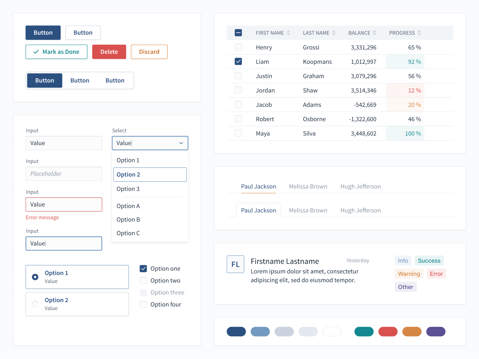
Adopting a design system helps ensure consistency within an app, and can even help different apps feel the same regardless of the underlying technology. This aids users in becoming proficient with the apps they use at the workplace.

Figure 3: An example of a design system
3. Measure success
Most business success metrics in organizations are not focused on the employee as a user of the software. It is important to introduce metrics within an organization to measure productivity and user satisfaction taking into consideration the software employees use daily. Some of these metrics are NPS and System Usability Score. This helps establish a baseline for continuous improvement.
Learn more about the importance of enterprise UX in our white paper Enterprise UX: Why it matters and what you can do about it. Get your copy!
