
With users accessing websites and applications across various devices and screen sizes, creating responsive layouts has become essential for web developers. Responsive design ensures your content looks great and functions well on everything from smartphones to large desktop monitors.
One approach to achieving responsive layouts in Vaadin is to use Lumo’s utility classes. These classes offer a convenient way to apply styles directly to our components and HTML elements, making it easier to create flexible and adaptive designs without writing extensive CSS code.
In this blog post, we'll explore their versatility starting with a simple example to illustrate the basic principles, then dive into more advanced techniques to create complex and dynamic designs.
Getting started
What are utility classes?
Utility classes are small, single-purpose CSS classes that can be applied directly to a component or HTML element to style them in a specific way. Unlike traditional CSS approaches, which often involve writing custom styles for each element, utility classes provide a more modular and reusable way to style your content.
Example 1: Layout direction
One of the most common examples is adapting the layout's direction based on screen size. For smaller screens, we'll opt for a column (vertical) layout, while for larger screens, we'll switch to a row (horizontal) layout:
Flow
Div div = new Div(
  new TextField("First name"),
  new TextField("Last name")
);
div.addClassNames(Display.FLEX, FlexDirection.COLUMN,
FlexDirection.Breakpoint.Medium.ROW, Gap.MEDIUM);
Hilla
<div class="flex flex-col md:flex-row gap-m">
  <vaadin-text-field label=”First name”></vaadin-text-field>
  <vaadin-text-field label=”Last name”></vaadin-text-field>
</div>
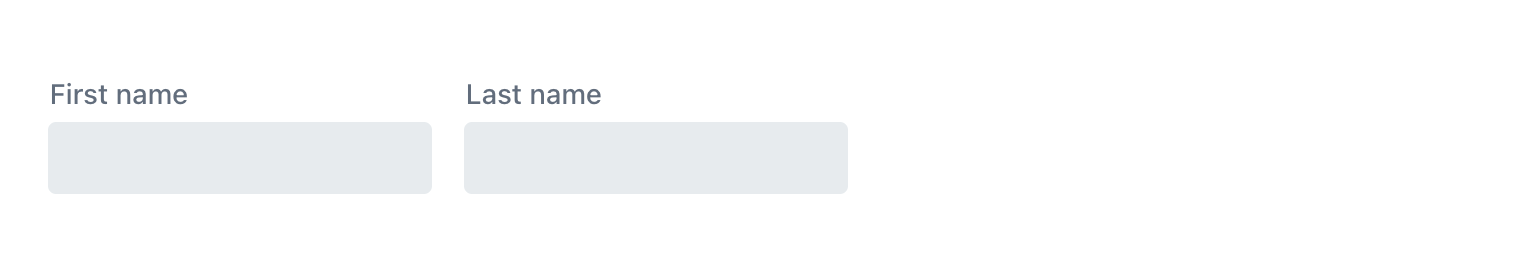
Fig 1. Row layout (viewport width ≥ 768px)
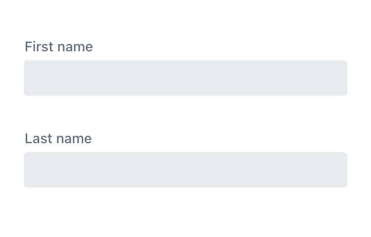
Fig 2. Column layout (viewport width < 768px)
In this example, the FlexDirection.COLUMN (flex-col) class sets the flex direction to the column, ensuring that the layout is stacked vertically on small screens. The FlexDirection.Breakpoint.Medium.ROW (md:flex-row) class overrides this on medium-sized screens, switching the flex direction to row.
By applying these simple utility classes, we've created a responsive layout that adjusts across different screen sizes.
Description lists are a common example of this technique. In the Vaadin+ project, we have implemented this approach for key-value pairs. See the demo or find the source on GitHub.
Example 2: Alignment
In addition to adjusting the flex direction, we can also apply responsive alignment styles. AlignItems (align-items) controls how flex items are aligned perpendicular to the direction of the flex-direction property, e.g., vertically when the flex-direction is a row and horizontally when it's a column.
Flow
Div div = new Div(...);

div.addClassNames(AlignItems.Breakpoint.Medium.BASELINE,
Display.FLEX, FlexDirection.COLUMN,
FlexDirection.Breakpoint.Medium.ROW, Gap.MEDIUM);
Hilla
<div class="flex flex-col md:flex-row gap-m md:items-baseline">
  …
</div>
Fig 3. Baseline alignment (viewport width ≥ 768px)
Fig 4. Default alignment (viewport width < 768px)
In this example, we've added the AlignItems.Breakpoint.Medium.BASELINE (md:items-baseline) class, which aligns items along the baseline for medium-sized screens when the layout is in row mode (FlexDirection.Breakpoint.Medium.ROW (md:flex-row)).
When the layout switches to column mode for smaller screens, we use the default alignment, meaning flex items are aligned to the start of the cross axis.
Understanding breakpoints
In responsive design, breakpoints are where your layout adjusts for different screen sizes and device widths. They help you define how your content should look based on the available screen space.
Breakpoints are set using CSS media queries, which, in our case, targets certain minimum screen widths and apply different styles accordingly. Lumo's breakpoints align with the defaults of Tailwind CSS and follow its naming convention:
| Breakpoint | CSS class name prefix | Minimum width (in pixels) |
|---|---|---|
| Small | sm | 640 |
| Medium | md | 768 |
| Large | lg | 1024 |
| XLarge | xl | 1280 |
| XXLarge | 2xl | 1536 |
It’s important to note that this follows a mobile-first approach. For example, Small indicates that the following styles will apply when the screen width is 640 pixels or wider, while Medium applies to screens 768 pixels wide or wider, etc.
Understanding breakpoints is crucial for creating responsive layouts. Now that we've covered the basics, let's delve into a more intricate example in the following chapter to see how breakpoints are applied practically.
Example 3: CSS grid layout
Flow
H2 title = new H2("Shipping information");
title.addClassNames(FontSize.XLARGE, Grid.Column.COLUMN_SPAN_4,
Margin.Bottom.SMALL, Margin.Top.MEDIUM);

TextField address = new TextField("Address");
address.addClassNames(Grid.Column.COLUMN_SPAN_4);

TextField city = new TextField("City");
city.addClassNames(Grid.Column.COLUMN_SPAN_2);

ComboBox state = new ComboBox("State");

TextField zip = new TextField("ZIP");

TextField phone = new TextField("Phone");
phone.addClassNames(Grid.Column.COLUMN_SPAN_2);
phone.setPrefixComponent(VaadinIcon.PHONE.create());

EmailField email = new EmailField("Email");
email.addClassNames(Grid.Column.COLUMN_SPAN_2);
email.setPrefixComponent(VaadinIcon.ENVELOPE.create());

Div div = new Div(title, address, city, state, zip, phone, email);
div.addClassNames(
  // < 1024 pixels
  Display.FLEX, FlexDirection.COLUMN,
  // > 1024 pixels
  Display.Breakpoint.Medium.GRID, Grid.Column.COLUMNS_4,
  // Horizontal spacing between components
  Gap.Column.MEDIUM
);
Hilla
<div class="flex flex-col md:grid gap-x-m grid-cols-4">
  <h2 class="text-xl mb-s mt-m col-span-full">Shipping information</h2>
  <vaadin-text-field class="col-span-full" label="Address"></vaadin-text-field>
  <vaadin-text-field class="col-span-2" label="City"></vaadin-text-field>
  <vaadin-combo-box label="State"></vaadin-combo-box>
  <vaadin-text-field label="ZIP"></vaadin-text-field>
  <vaadin-text-field class="col-span-2" label="Phone">
    <vaadin-icon slot="prefix" icon="vaadin:phone"></vaadin-icon>
  </vaadin-text-field>
  <vaadin-email-field class="col-span-2" label="Email">
    <vaadin-icon slot="prefix" icon="vaadin:envelope"></vaadin-icon>
  </vaadin-email-field>
</div>
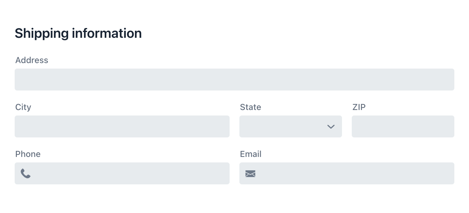
Fig 5. CSS grid layout (viewport width ≥ 768px)
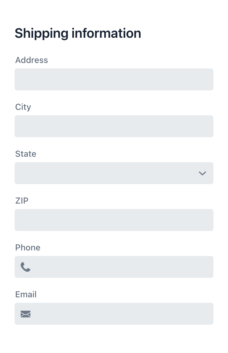
Fig 6. Column layout (viewport width < 768px)
Here's how the code works:
- The
Divelement serves as the container for the shipping information. It uses utility classes to define a flexbox layout (Display.FLEXandFlexDirection.COLUMN) by default. It switches to a grid layout with four columns(Display.Breakpoint.Large.GRID and Grid.Columns.COLUMNS_4)on larger screens. TheGap.Column.MEDIUMclass adds horizontal spacing between grid items. - The H2 element spans across all 4 columns (
Grid.Column.COLUMN_SPAN_4). - The form is structured using various input fields (
TextFieldandComboBox). Each field is assigned a specific number of columns to occupy within the grid layout using theGrid.Column.COLUMN_SPAN_{number}class. For example, the "City" field spans 2 columns (Grid.Column.COLUMN_SPAN_2), allowing it to occupy half the width of the grid.
This layout ensures that the form is presented in an accessible manner regardless of screen size. On smaller screens, the information is displayed in a single column, while on larger screens, it transitions to a grid layout with multiple columns, making efficient use of available screen space.
Example 4: Hiding and showing elements
One of the fundamental aspects of responsive web design is the ability to hide or show elements based on viewport size dynamically. By selectively displaying content tailored to specific viewports, users receive the most relevant information without overwhelming them with unnecessary clutter, resulting in a much more user-friendly experience.
Take, for example, a toolbar that contains various filters and buttons. On larger screens, such as desktops, the toolbar may be fully visible, providing easy access to all its features. However, on smaller screens, like those of smartphones, the toolbar could be hidden initially to preserve screen space. Instead, it might be replaced by a menu icon or button that, when clicked, reveals the toolbar options in a dialog, dropdown, or overlay.
Flow
H1 title = new H1("Page Title");
title.addClassNames(FontSize.XLARGE, Margin.End.AUTO);

Button filters = new Button(LumoIcon.SEARCH.create());
filters.addClassNames(Display.Breakpoint.Small.HIDDEN);
filters.addThemeVariants(ButtonVariant.LUMO_TERTIARY);
filters.setAriaLabel("Filters");
filters.setTooltipText("Filters");

Button settings = new Button(LumoIcon.COG.create());
settings.addThemeVariants(ButtonVariant.LUMO_TERTIARY);
settings.setAriaLabel("Settings");
settings.setTooltipText("Settings");

Div row1 = new Div(title, filters, settings);
row1.addClassNames(AlignItems.CENTER, Display.FLEX, Gap.MEDIUM);

TextField search = new TextField();
search.addClassNames(MinWidth.NONE);
search.setAriaLabel("Search");
search.setPlaceholder("Search");
search.setPrefixComponent(LumoIcon.SEARCH.create());

ComboBox category = new ComboBox();
category.addClassNames(MinWidth.NONE);
category.setAriaLabel("Category");
category.setPlaceholder("Category");

DatePicker date = new DatePicker();
date.addClassNames(MinWidth.NONE);
date.setAriaLabel("Date");
date.setPlaceholder("Date");

Div row2 = new Div(search, category, date);
row2.addClassNames(Display.HIDDEN, Display.Breakpoint.Small.FLEX, Gap.MEDIUM);

Div toolbar = new Div(row1, row2);
toolbar.addClassNames(Display.FLEX, FlexDirection.COLUMN, Gap.SMALL);
Hilla
<div class="flex flex-col gap-s">
  <!-- First row -->
  <div class="flex gap-m items-center">
    <h1 class="text-l me-auto">Page Title</h1>
    <vaadin-button aria-label="Filters” class="sm:hidden" theme="icon tertiary">
      <vaadin-icon icon="lumo:search" slot="prefix"></vaadin-icon>
    </vaadin-button>
    <vaadin-button aria-label="Settings" theme="icon tertiary">
      <vaadin-icon icon="lumo:cog" slot="prefix"></vaadin-icon>
    </vaadin-button>
  </div>
  <!-- Second row (hidden on mobile) -->
  <div class="hidden sm:flex gap-m">
    <vaadin-text-field aria-label="Search" class="min-w-0" placeholder="Search">
      <vaadin-icon icon="lumo:search" slot="prefix"></vaadin-icon>
    </vaadin-text-field>
    <vaadin-combo-box aria-label="Category"  class="min-w-0" placeholder="Category"></vaadin-combo-box>
    <vaadin-date-picker aria-label="Date"  class="min-w-0" placeholder="Date"></vaadin-date-picker>
  </div>
</div>

Fig 7. Filters visible; button hidden (viewport width ≥ 768px)
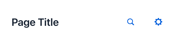
Fig 8. Filters hidden; button visible (viewport width < 768px)
Explanation:
- The outermost Div element has the utility classes
Display.FLEX (flex)andFlexDirection.COLUMN (flex-col), which apply flexbox styles and set the flex direction to a column. Inside this container, there are two rows. - The first row contains the page title and buttons. Its classes make its children align horizontally with a medium gap between them.
- The page title has the classes
FontSize.XLARGE (text-l)for large text size andMargin.End.AUTO (me-auto)for margin on the end, pushing the buttons to the other side. - The
Display.Breakpoint.Small.HIDDEN (sm:hidden)class on the "Filters" button hides it on screens with a viewport width above 640 pixels. - The second row contains a text field, combo box, and date picker. It features the classes
Display.HIDDEN (hidden)which makes it hidden by default andDisplay.Breakpoint.Small.FLEX (sm:flex)making it visible on screens wider than 640 pixels.
Overall, this code creates a responsive layout where the second row is hidden on mobile devices, and a button is shown instead. In this example, we've omitted the filter dialog code to maintain a focus on demonstrating the responsive utility classes. To briefly describe the dialog, it would include three input fields and an affirmative action button, such as 'Apply.'
Example 5: Responsive positioning
Another effective technique is responsive sidebars that transform into overlays on mobile devices. An example of this can be seen in the Product List template of the Vaadin+ project. See the demo and find the source on GitHub. It defaults to absolute positioning on mobile devices and switches to static positioning on screens with a width of 768 pixels or above.
Here’s a simplified version of the template:
Flow
public class HomeView extends Main {

  private Section sidebar;
  private Button toggle;

  public HomeView() {
    addClassNames(Display.FLEX, Height.FULL, Position.RELATIVE);
    add(createSidebar(), createContent());
  }

  private Section createSidebar() {
    H2 title = new H2("Sidebar");
    title.addClassNames(FontSize.MEDIUM);
    title.setId("sidebar-title");

    Button close = new Button(LumoIcon.CROSS.create(), e -> sidebar.setVisible(false));
    close.addClassNames(Display.Breakpoint.Large.HIDDEN);
    close.addThemeVariants(ButtonVariant.LUMO_TERTIARY);
    close.setAriaLabel("Close");

    Div header = new Div(title, close);
    header.addClassNames(AlignItems.CENTER, Display.FLEX, Height.XLARGE, JustifyContent.BETWEEN, Padding.End.SMALL, Padding.Start.MEDIUM);

    Div content = new Div();

    sidebar = new Section(header, content);
    sidebar.addClassNames(Background.BASE, Border.RIGHT, Display.FLEX, FlexDirection.COLUMN, Position.ABSOLUTE, Position.Breakpoint.Large.STATIC, Position.Bottom.NONE, Position.Start.NONE, Position.Top.NONE, ZIndex.XSMALL);
    sidebar.getElement().setAttribute("aria-labelledby", "sidebar-title");
    sidebar.setVisible(false);
    sidebar.setWidth(20, Unit.REM);
    return sidebar;
  }

  private Section createContent() {
    H2 title = new H2("Content");
    title.addClassNames(FontSize.MEDIUM);
    title.setId("content-title");

    toggle = new Button(LumoIcon.ANGLE_RIGHT.create(), e -> {
      sidebar.setVisible(!sidebar.isVisible());
      toggle.setIcon(sidebar.isVisible() ?
        LumoIcon.ANGLE_LEFT.create() : LumoIcon.ANGLE_RIGHT.create()
      );
    });
    toggle.addThemeVariants(ButtonVariant.LUMO_TERTIARY);
    toggle.setAriaLabel("Open");

    Div header = new Div(toggle, title);
    header.addClassNames(AlignItems.CENTER, Display.FLEX, Gap.SMALL, Height.XLARGE, Padding.Horizontal.SMALL);

    Div content = new Div();

    Section section = new Section(header, content);
    section.addClassNames(Display.FLEX, Flex.GROW, FlexDirection.COLUMN);
    section.getElement().setAttribute("aria-labelledby", "content-title");
    return section;
  }
}
Hilla
<main class="flex h-full relative">
  <!-- Sidebar -->
  <section class="bg-base border-r flex flex-col absolute lg:static bottom-0 start-0 top-0 z-10" aria-labelledby="sidebar-title" style="width: 20rem;">
    <div class="items-center flex h-xl justify-between pe-s ps-m">
      <h2 class="text-m" id="sidebar-title">Sidebar</h2>
      <vaadin-button aria-label="Close" class="lg:hidden" theme="icon tertiary">
        <vaadin-icon icon="lumo:cross"></vaadin-icon>
      </vaadin-button>
    </div>
    <div>...</div>
  </section>
  <!-- Content -->
  <section class="flex flex-col grow" aria-labelledby="content-title">
    <div class="items-center flex gap-s h-xl px-s">
      <vaadin-button aria-label="Toggle" theme="icon tertiary">
        <vaadin-icon icon="lumo:angle-left"></vaadin-icon>
      </vaadin-button>
      <h2 class="text-m" id="content-title">Content</h2>
    </div>
    <div>...</div>
  </section>
</main>
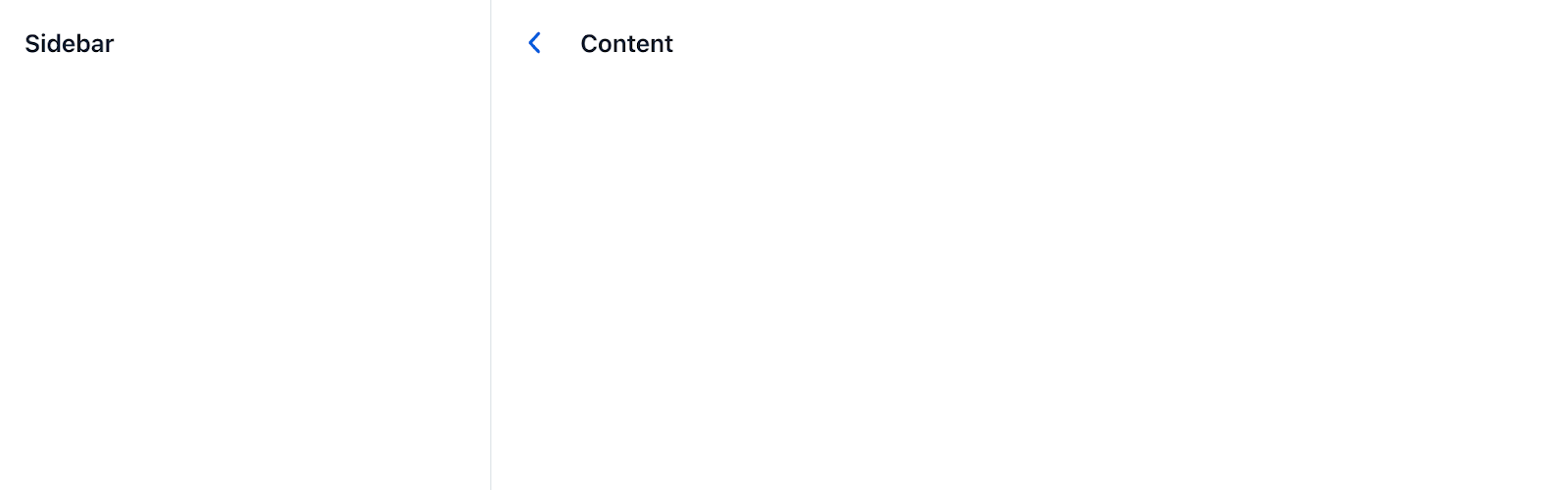
| |
|
| |
|
| Fig 9. Sidebar closed (top) and opened (bottom) – viewport width ≥ 768px |
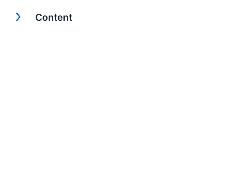
| |
|
| Fig 9. Sidebar closed (left) and opened (end) – viewport width < 768px |
|

Here’s the breakdown:
- The
Main (main)element acts as the container for the sidebar and content. It's turned into a flex layout with relative positioning to contain the sidebar. - The sidebar is positioned absolutely above the content using
Position.ABSOLUTE (absolute)andZIndex.XSMALL (z-10).- It covers the full height of the viewport on smaller screens using
Position.Bottom.NONE (bottom-0),Position.Start.NONE (start-0)andPosition.Top.NONE (top-0). - On larger screens, it switches to static positioning with
Position.Breakpoint.Large.STATIC (lg:static), appearing inline with the content.
- It covers the full height of the viewport on smaller screens using
- The sections are labeled for accessibility reasons using
aria-labelledby. - The sidebar features a title and a close button.
- The button is hidden on larger screens using
Display.Breakpoint.Large.HIDDEN (lg:hidden). It is only needed when the sidebar overlays the content, which occurs on screens narrower than 1024 pixels (i.e., at theLarge breakpoint).
- The button is hidden on larger screens using
Final thoughts
Creating responsive layouts with utility classes can greatly simplify the development process and ensure a seamless user experience across different devices. We've covered the basics of using utility classes for responsive design, explored the importance of breakpoints, and looked at practical examples of flexbox layouts, grid forms, and dynamic element visibility and positioning.
We hope this article has provided valuable insights and techniques to enhance your app’s responsiveness. We’d love to hear your feedback. Please share your experiences and let us know what challenges you've faced when building responsive layouts, views, or apps. Your input will help us address common issues in future content.
Got questions on the topic? Comment them below or join a conversation on the Vaadin Forum!