What is new in Vaadin 14
Here are the highlights of the new and improved features in Vaadin 14 long-term support (LTS).
The latest stable release of Vaadin 14 is 14.12.7, published on Apr 05, 2025. You can find all the release notes of the Vaadin platform in GitHub.
New in 14.7
Please see the release notes on GitHub for details.
Better Theming support
A custom theme is the easiest way to provide a custom look and feel for your entire application. It can be packaged as a dependency for reuse in multiple applications, as described in Packaging a Theme for Reuse. The CSS in a custom theme is always applied on top of the default Lumo theme. Read the documentationNew Feature in vaadin-grid-pro
Add option for single-click edit toggle. Try demo.New in 14.5
Better URL parameter support
Parameters can now be placed also between view names in the URL structure.
LitTemplate support
Using LitTemplate is recommended over the deprecated PolymerTemplate for creating layouts with HTML and Java UI logic. It is recommended to use TypeScript for the template, and this has been updated to the examples in the documentation. Starting from Vaadin 18, the initial attribute values in the template are reflected to the server-side state when @Id mapping components. This applies to PolymerTemplates too.
Component updates
Avatar and AvatarGroup components that are used in Collaboration Engine.
New in 14.4
Faster dev-mode startup
The development-mode server now runs in a separate thread. This means that server startup is no longer blocked by the frontend resources install and webpack dev-server startup. Larger, real-world projects, such as those with ORM initialization (for example Hibernate), should see a clear improvement in development-mode startup times.
Field helper text for input components
Form input components now have the option to add helper text below or above the field. Helper text is useful to provide the user with context about a field’s input, for example how the input will be used.
The following components implement the HasHelper interface: EmailField, PasswordField, TextField, TextArea, CheckboxGroup, RadioButtonGroup, BigDecimalField, IntegerField, NumberField, DatePicker, DateTimePicker, TimePicker, ComboBox, Select, and CustomField.
DateTimePicker dateTime = new DateTimePicker("DateTimePicker");
dateTime.setHelperText("Helper text");

Live reload for front end changes
The live-reload feature now does the automatic browser refresh also after webpack has compiled your CSS files, view templates, and other JavaScript files in the project frontend folder.
Learn how to set up Live Reload.
New in 14.3
Live reload when using Java hot-swap tools
When using HotswapAgent, Spring Boot DevTools or JRebel, the browser is now automatically refreshed as soon as the Java changes have been compiled.
Support for right to left languages
The RTL support released in Vaadin 16 is now backported to Vaadin 14.3.
New in 14.2
Modeless, resizable and draggable dialogs
Dialogs can now be modeless, resizable and draggable.
A modeless dialog is one that opens on a parent UI, but the parent remains active and can still receive focus and other UI interactions. A modeless dialog allows simultaneous interaction with multiple other dialogs and with the UI behind it. It is useful when you need information from the main UI for whatever you're doing in the dialog. You could, for example, create a floating note pad in which you can type notes while working in the main UI.
Here is a video showing one example of what you could build with the feature.
The source code used in the example is available in GitHub.
import com.vaadin.flow.component.dialog.Dialog;

public class MyDialog extends Dialog {

    public MyDialog() {
        setDraggable(true);
        setModal(false);
        setResizable(true);
    }
}
New DateTimePicker component
The new DateTimePicker component is a composite of DatePicker and TimePicker, but it produces a single LocalDateTime value, which you can use in form data binding. Previously you had to have two separate fields for time and date, and if the data model used for binding had a single DateTime property (instead of a separate date and time), you also needed to split and join them manually.
import java.time.Duration;
import java.time.LocalDateTime;
import com.vaadin.flow.component.datetimepicker.DateTimePicker;

DateTimePicker dateTimePicker = new DateTimePicker();
dateTimePicker.setMin(LocalDateTime.now());
dateTimePicker.setStep(Duration.ofMinutes(30));
dateTimePicker.setDatePlaceholder("Pick a date");
dateTimePicker.setTimePlaceholder("Pick a time");
Improved FlexLayout Java API
The API for FlexLayout has been enhanced with more CSS properties that are accessible as methods. It is no longer necessary to use the low-level Element API. New methods include setAlignContent, setFlexBasis and setFlexDirection. FlexLayout is intended for developers who want to work with Flexbox layouting in Java. It provides a more direct API to CSS Flexbox than HorizontalLayout and VerticalLayout does.
New Scroller component
Scroller is a new component in 14.2 that allows you to create a scrollable area. You can set the area as scrollable in a vertical and/or horizontal direction. Previously, creating the same behavior involved manually setting CSS overflow on either a separate stylesheet or through the styling Java API.
import com.vaadin.flow.component.orderedlayout.Scroller;
import com.vaadin.flow.component.orderedlayout.Scroller.ScrollDirection;

Scroller scroller = new Scroller(myContent, ScrollDirection.BOTH);
Read Vaadin 14.2 release blog post for more details.
Option to use pnpm for frontend build
- Faster build: pnpm only downloads packages once and reuses them from a local cache. It reduces downloads and IO operations, saving build time on your local machine and CI system.
- Improved reliability and reduced complexity: no need to delete package.json, lock file or the node_modules folder when updating the Vaadin version in your project.
In 14.2 npm is still used by default.
Faster development-mode frontend builds
Starting from 14.2, the transpilation of JavaScript code to ES5 (required by IE11) is not done by default in development mode, but you can still enable it with configuration, if necessary. For production builds with the build-frontend goal, it is still done by default.
This makes a big difference for the initial webpack startup and frontend compilation time, reducing it significantly from for example 20 seconds to 5 seconds.
Automatic Node.js install
Starting from versions 14.2 and 16 the Node.js install (which includes npm) happens automatically. It is installed to a .vaadin folder inside the home folder, and reused from there for all Vaadin projects. Note: Node is only used to build the frontend side of things; it does not run after you deploy for production!
Read Improving the developer experience for Java developers for more details.
New in 14.1
Generic drag and drop
Build applications now support DnD operations in the same UI. The new DragSource and DropTarget interfaces allow you to turn any UI component into a draggable component or one capable of receiving dropped components.
VerticalLayout myDropReceiver = new VerticalLayout();
Button myDraggedComponent = new Button("Drag");

DragSource<Button> dragSource = DragSource.create(myDraggedComponent);
dragSource.addDragStartListener((DragStartEvent<Button> event) -> {
  // You can set some meta data for the drag with event.setDragData(Object)
  // Highlight drop areas with your custom code
});

dragSource.addDragEndListener((DragEndEvent<Button> event) -> {
  // React to drag end and possibly call event.clearDragData();
});


DropTarget<VerticalLayout> dropTarget = DropTarget.create(myDropReceiver);
dropTarget.addDropListener((DropEvent<VerticalLayout> event) -> {
  // Decide what to do with the drop using e.g.
  // Optional<Object> myDragData = event.getDragData();
  // Optional<Component> dragSourceComponent = event.getDragSourceComponent();
});
Faster development-mode build
The development-mode build time is reduced for projects that have a lot of code or big external libraries as dependencies. With 14.0, server startup and update after changes was slow with certain reload tools. With version 14.1, the application build is significantly faster, in particular for Spring Boot projects that don’t have black/white-listings for the libraries they use.
MultiSelectListBox component
ListBox has now a multi-select version called MultiSelectListBox.
Input fields for Integer and BigDecimal types
IntegerField and BigDecimalField allow you to bind field values to Integer and BigDecimal types, without the tedious value conversion from String or Double.
Binder<MyBean> binder = new Binder<>();
IntegerField likesField = new IntegerField();
BigDecimalField financesField = new BigDecimalField();
binder.bind(likesField, MyBean::getNumberOfLikes, MyBean::setNumberOfLikes);
binder.bind(financesField, MyBean::getFinances, MyBean::setFinances);
New Grid column APIs
- Grid.scrollToIndex(index) method: Allows you to scroll the grid programmatically to a specific index.
- ColumnResizeListener: Adds the possibility to react to user-originated column-resize events and to read/write new widths to columns.
- ColumnReorderListener: Adds the possibility to react to user-originated column-reorder events and to programmatically apply a new column order.
- Grid context menu contents can now be created dynmically when clicked based on the clicked row
RichTextEditor HTML write API
Users are no longer restricted to only the controversial Delta format when setting the value for the rich text editor. As an alternative, they can now set the value of the editor as HTML.
RichTextEditor rte = new RichTextEditor();
Binder<MyBean> binder = new Binder<>();
binder.bind(rte.asHtml(), MyBean::getHtml, MyBean::setHtml);
More positioning options for CRUD editor
The CRUD component data editor for a selected row can now be placed below or on the side of the grid. Previously, you could only show the editor as a popup.
import com.vaadin.flow.component.crud.Crud;
import com.vaadin.flow.component.crud.CrudEditorPosition;

Crud<MyBean> crud; /* Initialization omitted */
crud.setEditorPosition(CrudEditorPosition.BOTTOM);
crud.setEditorPosition(CrudEditorPosition.ASIDE);
crud.setEditorPosition(CrudEditorPosition.OVERLAY);
New in 14.0
Support for npm, Polymer 3 and ES6 modules
We've updated how Vaadin 14 loads Web Components. Previously the framework loaded components using HTML Imports. Browser vendors have been reluctant to implement HTML Imports, and Chrome has deprecated the native support for it. Since Vaadin 14 we now support using ES6 Modules for importing Web Components. At the same time, Polymer version bumps to 3. Using HTML Imports with Polymer 2 is still supported in Vaadin 14 through a compatibility mode.
Web Components for Vaadin projects were previously packaged as WebJars through Bower package manager. Using Bower for frontend dependencies is currently discouraged, and npm has become the defacto standard. In Vaadin 14 npm is used as the frontend package manager. Bower and WebJars are still fully supported in Vaadin 14.
If you want to change your existing project to use the new frontend packaging, you can do it manually or use an upgrade tool (available June 2019). You can keep using the Vaadin 10 project structure in Vaadin 14 without any changes.
Simplified styling of application and components
It's now drastically simpler to include CSS files into your project. Just put the files in your frontend folder or sub-folders and include them with @CssImport. Also, you don't need to write Polymer specific boiler-plate code anymore to inject a component theme as a dom module. CssImport is not supported in the Vaadin 13 compatibility mode.
@Route
@CssImport("styles/styles.css")
@CssImport(value = "styles/components/charts.css",
     themeFor = "vaadin-chart",
	 include = "vaadin-chart-default-theme")
public class MainLayout extends VerticalLayout {

}
Grid row drag and drop
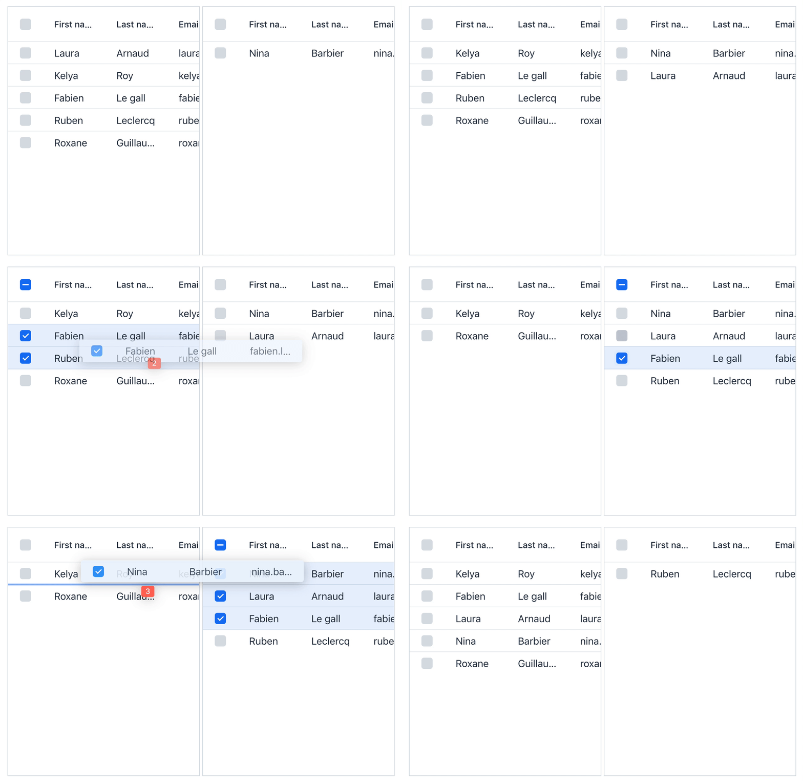
Grid now includes a built-in drag and drop support for the rows. The feature enables adding functionality such as row reordering or moving items between grids by dragging. Both single and multi-row dragging is supported. Individual rows can be excluded from dnd operations by using drag and drop filters.
Grid<Person> grid = new Grid<>(Person.class);
grid.setRowsDraggable(true);
grid.setDropMode(GridDropMode.BETWEEN);
// Register listeners for the dnd events
grid.addDragStartListener(event -> {

});

grid.addDragEndListener(event -> {

});

grid.addDropListener(event -> {

});

Preserve application state on browser refresh
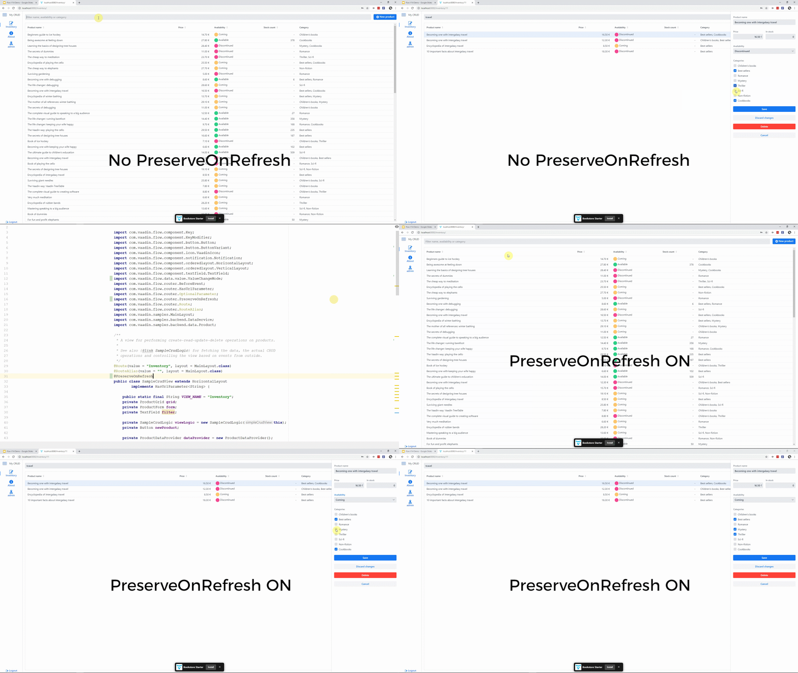
Applying the @PreserveOnRefresh annotation on your view preserves any made changes to the view if the browser is refreshed. The annotation can be placed on a @Route component, and it applies when that view is open, or it can be placed on a layout in the navigation hierarchy to apply it to all views shown inside the layout.

Embedding Vaadin applications
Starting from Vaadin 14, it is be possible to embed your Vaadin applications into any web page as a web component. Embedding allows you to build micro-frontend style applications with Vaadin. Another use case is a phased modernization of your legacy app, e.g. when you don't want to rewrite your JSF applications completely, but you want to modernize only parts of the UI.
The embedding is done by exporting any server-side Java component using the exporter class. The web component is then included to the embedding page like any web component, and the interaction between the apps is possible by using properties and events. The restriction that you have to mind is that there are no conflicting frontend resources used by embedding and the embedded apps.
public class ExpertChatComponent extends VerticalLayout {

  // basic component implementation omitted

  public void onUserBrowsingContextChange(String userContext) {
    // Called when the property value changes
  }
}

@Push
public class ExpertChatExporter extends WebComponentExporter<ExpertChatComponent> {
  public ExpertChatExporter() {
    super("expert-chat");
    addProperty("user-context", null)
      .onChange(ExpertChatComponent::onUserBrowsingContextChange);
  }

  @Override
  public void configureInstance(WebComponent<ExpertChatComponent> webComponent,
      ExpertChatComponent component) {
    // Nothing to configure in this example
  }
}
Menu Bar
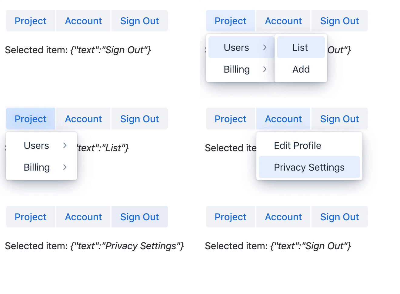
The Menu Bar component displays a horizontal menu with dropdown sub-menus. Selecting the items on the menus can be configured to trigger actions, and they can be disabled/decorated with custom content. The sub-menus can also be configured to open automatically when the mouse hovers over a menu item.
MenuBar menuBar = new MenuBar();
Text selected = new Text("");

// Define menubar items
MenuItem project = menuBar.addItem("Project");
MenuItem account = menuBar.addItem("Account");

SubMenu projectSubMenu = project.getSubMenu();
MenuItem users = projectSubMenu.addItem("Users");
MenuItem billing = projectSubMenu.addItem("Billing");

// Register actions to item selections
SubMenu usersSubMenu = users.getSubMenu();
usersSubMenu.addItem("List", e -> selected.setText("List"));
usersSubMenu.addItem("Add", e -> selected.setText("Add"));

SubMenu billingSubMenu = billing.getSubMenu();
billingSubMenu.addItem("Invoices", e -> selected.setText("Invoices"));
billingSubMenu.addItem("Balance Events",
e -> selected.setText("Balance Events"));

account.getSubMenu().addItem("Edit Profile",
e -> selected.setText("Edit Profile"));
account.getSubMenu().addItem("Privacy Settings",
e -> selected.setText("Privacy Settings"));

Responsive side menu for App Layout
App Layout gets a new feature for creating responsive side navigation. The navigation drawer collapses on small screens and can be expanded by the user.
public class MainLayout extends AppLayout {

  public MainLayout() {
    final DrawerToggle drawerToggle = new DrawerToggle();
    final RouterLink home = new RouterLink("Main", MainView.class);
    final RouterLink about = new RouterLink("About", AboutView.class);
    final VerticalLayout menuLayout = new VerticalLayout(home, about);
    addToDrawer(menuLayout);
    addToNavbar(drawerToggle);
  }
}

@Route( layout = MainLayout.class)
public class MainView extends VerticalLayout {
}

@Route(layout = MainLayout.class)
public class AboutView extends VerticalLayout {
}
Browser details API
It's possible to read client details like time zone setting and screen dimensions on the server-side code.
ui.getPage().retrieveExtendedClientDetails(details -> { /* e.g. details.getTimeZoneId(); */ }));
Return values from JavaScript execution to server-side
Sometimes you need to access some critical information from the browser on the server-side Java code. Now that information is available for you, which makes it easier to integrate web components and frontend libraries to your project.
getElement().executeJs("return 'adoptedStyleSheets' in document")
    .then(Boolean.class, supported -> {
  if (supported) {
    System.out.println("Feature is supported");
  } else {
    System.out.println("Feature is not supported");
  }
});
Automatic width for Grid columns
Grid’s columns can be set to determine their width automatically by enabling the "auto width" flag. Once the first rows for the grid are rendered, the columns with the flag enabled determine their width based on the physical size of the column cells' content.
grid.getColumns().forEach(column -> column.setAutoWidth(true));
Custom editor and renderer for Grid Pro
Grid Pro now also has Java APIs for defining custom content for the cell editors. Any field that exposes a value can be used as an editor component. The cell representation, while not in the edit mode, can also be customized with a renderer.
// Using a ComponentRenderer to create custom representation
// for the boolean value.
ComponentRenderer<Span, Person> booleanRenderer = new ComponentRenderer<>(person ->
  new Span(person.isSubscriber() ? "Yes" : "No")
);
grid.addEditColumn(Person::isSubscriber, booleanRenderer)
    .checkbox((item, newValue) -> item.setSubscriber(newValue))
    .setHeader("Subscriber (editable)");

// Using a native input as the editor field for the column
Input customInput = new Input();
grid.addEditColumn(Person::getEmail)
    .custom(customInput, (item, newValue) -> item.setEmail(newValue))
    .setHeader("Email")
    .setWidth("300px");
Field value clear button visibility
The button for clearing the field value is now hidden by default for Combo Box, Date Picker, and Time Picker components. Showing the clear button needs to be explicitly enabled. Note that this is a change in default behavior since previous releases.
// Display an icon which can be clicked to clear the value
comboBox.setClearButtonVisible(true);
Lazy and Timeout modes for text field value change
Sometimes you need to take more control over when or how often the browser sends the user’s input to the server-side. Now, this is possible with the new value change modes that apply to the text input field components:
filter = new TextField();
filter.setPlaceholder("Filter name, availability or category");
filter.setValueChangeMode(ValueChangeMode.LAZY);
Improved keyboard accessibility for Select
The Select component no longer requires opening the dropdown for selecting a value. Users can change the value by typing it (or part of it) with the keyboard while the field is focused.Notification theme variants
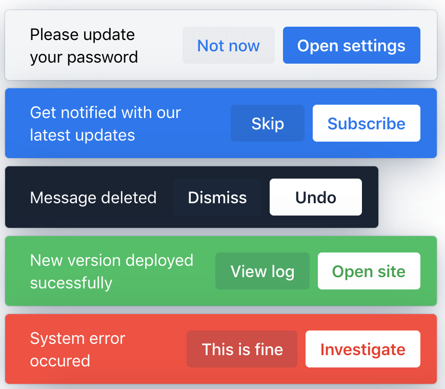
Notification component introduces built-in theme variants for the Lumo theme. The new variants are Primary, Contrast, Success, and Error.
notification.addThemeVariants(NotificationVariant.LUMO_PRIMARY);
notification.addThemeVariants(NotificationVariant.LUMO_CONTRAST);
notification.addThemeVariants(NotificationVariant.LUMO_SUCCESS);
notification.addThemeVariants(NotificationVariant.LUMO_ERROR);

How to upgrade
The latest stable release of Vaadin 14 is 14.12.7.
Update the version number in your pom.xml
<dependencyManagement>
    ...
    <dependency>
        <groupId>com.vaadin</groupId>
        <artifactId>vaadin-bom</artifactId>
        <version><!-- version number --></version>
        <type>pom</type>
        <scope>import</scope>
    </dependency>
    ...
</dependencyManagement>
For updating from Vaadin 10-13, follow the Vaadin 14 Migration Guide.
Users of Vaadin 8, should follow the migration guide.
Incompatible changes in each version after 10.0
Vaadin 14
- Grid Pro - The keepEditorOpen property has been removed. Now by default, the editor is kept open when moving from a cell to another. To get the old behavior set singleCellEdit on.
- App Layout - The API has been redesigned. Migration guide is targeted for the final release.
- Combo Box, Date Picker, Time Picker - Field value clear button visibility default has been changed. Now it's hidden by default and can be set visible in code.
- When updating from previous version to 14.1 you might need delete package-lock.json file and node_modules directory. In the error message only node_modules is mentioned.
Vaadin 13: Spring integration, Context Menu, Grid
Vaadin 12: Combo Box
Vaadin 11: No incompatible changes
Supported browsers and Java versions
Supported browsers
Supported Java versions
Java 8, Java 11 and the latest Java.
For a detailed list of supported browsers, development environments, and deployment environments, see the full release notes.
Free support until the end of June 2024
Vaadin 14 is a long-term support release (LTS). It is maintained until the end of June 2024. Maintenance guarantee starts from the general availability release (GA). Paid extended maintenance support is available.