Theming, styling, look and feel
This chapter covers how to adjust the visual look of your application, including styles, icons, homescreen icons, and some other customisations for mobile.
It should be noted up-front that the application comes with two parts that need to be styled separately: 1) login.html which has minimal CSS defining the look of the login screen, and 2) the actual application which has a visual theme built with SCSS (https://sass-lang.com/) using the customizable Valo theme engine (https://vaadin.com/docs/v8/framework/themes/themes-valo).
|
Tip
| More information about theming Vaadin applications: https://vaadin.com/docs/v8/framework/themes/themes-overview |
Tools
Various editors have support for SCSS, and you can use any editor you like, but notice that the IDE might need a nudge (refresh) once you’re done editing the theme.
To get better integration with the IDE, you can also install a plug-in, e.g LiClipseText - recent Eclipse versions will notify that there are editors available to install. You can also use Eclipse’s built-in CSS or plain-text editors.
If your IDE is set up to auto-redeploy resources, you’ll see the changes in your application after a browser reload.
|
Tip
| If you’re using Vaadin Designer, it will notice changes to the theme and live-update the design to match, including any external previews you have open. This is a convenient way to style, allowing you to preview multiple sizes at once. |
Compiling
If you delete the pre-compiled styles.css, the application will auto-update the theme during development.
|
Tip
| If your theme stops auto-updating, check if you inadvertently compiled the theme and now have a styles.css |
However, when deploying the application, you should make sure you have a compiled and up-to-date styles.css.
Source code
mvn vaadin:compile-themePlease not that if you use an IDE, such as Eclipse, but edit files with an external editor (e.g Atom to edit SCSS), or use the command-line, you might have to 'refresh' your project (or the relevant folders) for your IDE to notice the changes.
|
Tip
| More information about compiling the theme: https://vaadin.com/docs/v8/framework/themes/themes-compiling |
Styling the login screen
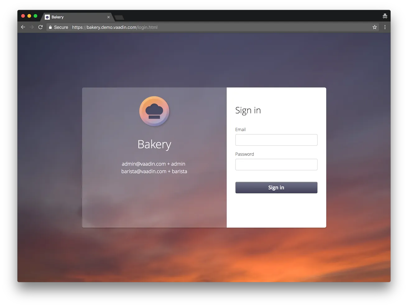
The login screen is defined in the stand-alone login.html file. It has a pretty simple DOM structure, which can still support multiple screen sizes and layouts. The included CSS makes the button and fields approximate the style of the application, and defines some responsive behaviour; on narrow screens the layout is simple, but on wider screens there is a styled box in the center of the screen, floating over a background image.

The main color #4b4b65 is set as background-color in a few places and can easily be replaced.
The background-image is defined in one breakpoint, for screens wider than 1000px. As a result, it will not be loaded on smaller screen sizes. Additionally, a gradient is used to approximate the look of the background image on smaller devices to make the application immediately recognisable.
You can modify the background-image or gradient, or remove them entirely:
Source code
@media (min-width: 1000px) {
    html {
        background: linear-gradient(145deg, #484962 30%, #d06b41 100%);
    }
    body {
        background-color: transparent;
        background-image: url(VAADIN/themes/apptheme/bg.jpg);
        background-size: cover;
    }
}
Styling the application
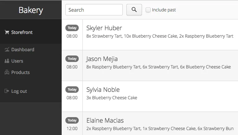
The application theme consists of a number of SCSS-files that are compiled into one CSS file. The different files are described below.
styles.scss
This is the theme “entrypoint” that should generally not be touched. If you compile the theme manually, this is the file you want to compile.
styles.css
This is the compiled CSS version of the application theme, to be directly used by the application. Note that if your project contains this file, no auto-compilation of the theme will take place, and you’ll have to trigger a compile after modifying the theme. I.e you might not want to have this file while developing, but you definately need this file when going to production.
addons.scss
This file contains styles imported from addons, if any. There is usually no need to touch this, except to check what styles an add-on might have out-of-the-box.
designs.scss
Here you can find styles imported from Vaadin Designer templates.
For clarity, it’s recommended not to modify these, and override things in your own theme files instead. However, this is just a guiding principle - as long as you don’t delete the “// Styles imported from xyz” comment, your modifications will not be overridden.
apptheme.scss
This is you main theme file. Here, you configure Valo parameters, as well as set up any global variable you might want to use in your application theme. You also import and include the various sub-parts of your theme.
In applications with really limited styling, you might just have one apptheme.scss, but usually it makes sense to split things. As a rule of thumb, put each independent part (view, component) that requires some amount of styling in its own file.
The scss files specific to this project start with underscore, and the name indicates the scope of the file. Each file consists of a mixin, that is then included in the appropriate place within apptheme.scss.
Adjusting Valo parameters
Various aspects of the theme can be easily adjusted by changing parameters. A number of these are listed in the beginning of apptheme.scss.
For instance, the menu-bar gets it’s color from the v-focus-color, in effect acting as a sort of main color for the theme:
Source code
$v-focus-color: #333;To see the effect, you can disable the background-gradient and -image:
Source code
$app-background-gradient: false;
$app-background-image: false;
You now have a dark-gray application without background image or gradient.

_dashboardview.scss
Styles for the Dashboard, which is implemented using Vaadin Board and Vaadin Charts.
|
Tip
| A good starting point for styling Vaadin Charts can be found here: https://vaadin.com/blog/styling-your-vaadin-charts |
The main things done here is 1) joining the first row into a joint “panel”, while the other rows’ content is styled as separate panels 2) making sure padding and spacing follows Valo parameters.
There is one responsive breakpoint, which reduces spacing and removes side-margins on narrow devices.
_menu.scss
Styles for the responsive menu.
Because it’s responsive, styles for different screen-sizes appear in separate sections. Notice that Vaadin responsiveness works with regard to the parent element (as opposed to the browser size), so that components can adjust based on the space available to them, regardless of window/device size.
A responsive selector looks like this:
Source code
.app-shell[width-range~="-600px”] { … }In this case, the rules within the block will take effect when the element with the app-shell class is up to 600px wide.
You can remove all styles in _menu.scss and still have a decent-looking application, as it is based on a Vaadin Designer template.
_ordersgrid.scss
Styles for the grid that lists all orders, including the filters.
Most of the styling here applyes different colors and icons to depending on the order’s status.
_ordersview.scss
Styles for the form that is used to input new orders, as well as display the details of the existing orders.
This particular view shows how to do a responsive layout “from scratch”, using mostly CSSLayouts and laying things out in CSS. This is a good approach if 1) you have a fairly small view, 2) specific behaviour in mind.
This particular view is set up so that fields (or a group of related fields) basically split the view in half, but on small devices the fields take up the whole width. It’s worth considering using Vaadin Board to achieve a similar effect - it can be seen in action on the dashboard view.
Note that ProductInfo is a separate component (defined in ProductInfoDesign) within the OrderEditView which uses the same responsive styles.
Icons, logos and viewport configuration
Favicon
There is a favicon.ico which can be replaced; it will show up in the browser tab, bookmarks, and such, depending on the browser used.
Homescreen icons
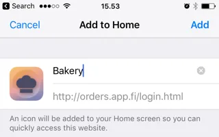
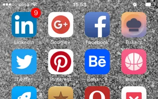
The theme also contains two sizes of application icons; these are also used as logo on the login-screen, but the main use case is to be used as “homescreen” icons when added to the homescreen of a device. You can either just replace these two icons, or if you want to add different sized icons, or remove the icons altogheter, you can do so in ApplicationServlet.IconBootstrapListener.


Viewport configuration
Making the application work well on mobile devices of various sizes requires us to tell the device how we intend it to be shown. We can do this by adding a @Viewport annotation to the AppUI class.
Source code
<meta name="viewport" content="width=device-width,initial-scale=1.0,user-scalable=no">Applications that are built for mobile tend to give a more robust feel if zooming is turned off, but you might want to turn it back on, if your application contains content that the user might want to zoom.
Full screen app
If you want your application to run full-screen - without any browser controls, just like a native app - you can add the mobile-web-app-capable meta-tag.
Source code
<meta name="mobile-web-app-capable" content="yes">
<meta name="apple-mobile-web-app-capable" content="yes">
There is commented code ready to be enabled in ApplicationServlet.IconBootstrapListener
Don’t forget login.html
Remember that login.html is a stand-alone page, and has all the icons/viewport tags mentioned above added separately; please remember to update it as well.
In fact, you might want to start customising by setting up login.html so that it works as you wish, then modify the Java code to match.