
Swing

Vaadin

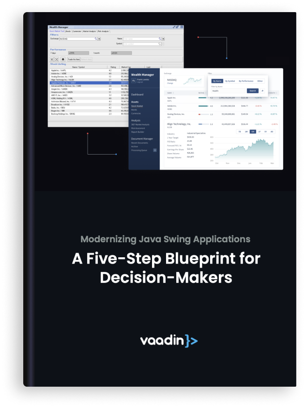
Ready to kill the tail on legacy dependencies and bring your Java Swing application to the future?
Download our white paper, ‘Modernizing Java Swing Applications: A Five-Step Blueprint for Decision-Makers,’ to learn how to automate your Swing-to-Web migration with the Vaadin Modernization Toolkit.

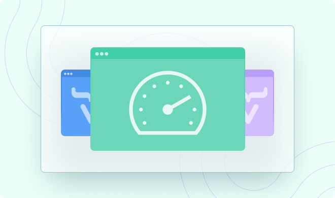
Get the job done with automation
Many conventional Java modernization projects adopting a phased approach can take years to complete, and developers often lack the motivation to finish. The automation provided by the Vaadin Modernization Toolkit can refactor the bulk of your Java code so you can quickly kill the tail of legacy dependencies and move forward with an architecturally coherent new application.

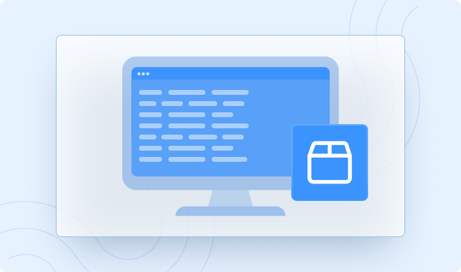
Fully customizable transformations
The Vaadin Migration Toolkit includes a default set of transformation capabilities, enabling the most common features found in legacy frameworks. These can be extended with the APIs used in your application or customized if your application has tailored the legacy technology with non-standard behavior.

Trusted by award-winning companies to create award-winning software
From the list of the most influential FinTechs to the Best SaaS from the Cloud Awards, companies rely on Vaadin to create cutting-edge applications that make a big impact. The Vaadin Modernization Toolkit gives you a boost to accelerate your Java migration to modern web apps.

Java migration, not emulation
The Vaadin Migration Toolkit helps migrate Java applications to Vaadin Flow, Vaadin’s open-source framework for building web applications with Java. After the migration, there will be no remaining dependencies on old frameworks such as Vaadin 7/8 or Java Swing The Toolkit supplies useful features familiar to developers from old frameworks in a Feature Pack, but it does not emulate technologies like Swing.
Code readability built-in
We built the Migration Toolkit to produce code that humans can read and maintain. Your transformed application sources retain the original structure, naming conventions, comments, and whitespace. Changes made by the transpiler are almost always applied within the same line of code, meaning your developers can confidently take ownership.

Fine-tuning: Reach your target automation with a fixed-price guarantee
The engineers at Vaadin offer a fixed-price Fine-tuning service to improve the Standard Rules, Custom Rules, and Feature Pack to reach a higher degree of automation for your application. The transpiler can also be iteratively improved to automate a higher percentage of the work.
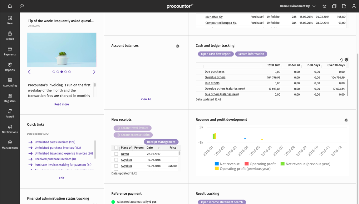

When Apple dropped support for their own JVM, we had to start supporting a Swing version of our app as well. The abstraction layer made it a natural choice for us to do the same with Vaadin, knowing that the API was so similar to both Swing and AWT. And that's what we did. Quite successfully I might add.

Lauri Lehtonen
CTO, procountor


Talk to our Team
Modernization, not just migration
Book a free consultation with our expert to learn more how the Modernization Toolkit turns your old apps into modern web apps.