Components
Form Inputs
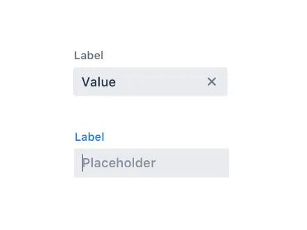
Input Fields
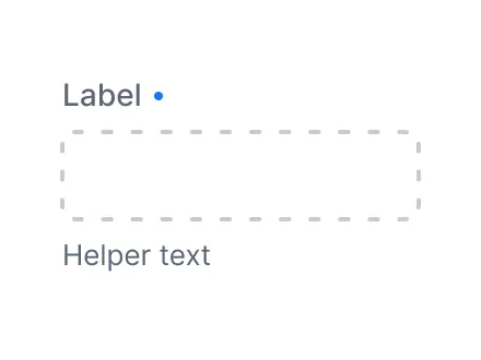
Input field components have common features such as label, helper text, disabled and required states, and more. See Input Fields
Combo Box
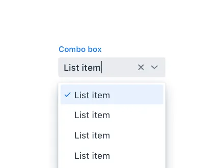
Combo Box allows the user to choose a value from a filterable list of options presented in an overlay. See Combo Box
Custom Field
Custom Field is a component for wrapping multiple components as a single field. See Custom Field
Date Picker
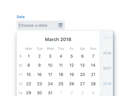
Date Picker is an input field that allows the user to enter a date by typing or by selecting from a calendar overlay. See Date Picker
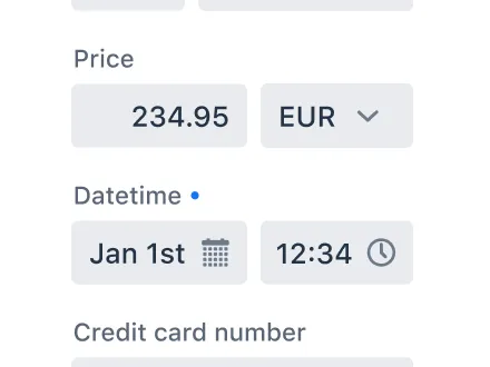
Date Time Picker
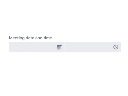
Date Time Picker is an input field for selecting both a date and a time. See Date Time Picker
Email Field

Email Field, an extension of Text Field, only accepts email addresses as input. See Email Field
List Box
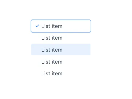
List Box allows the user to select one or more values from a scrollable list of items. See List Box
Number Field
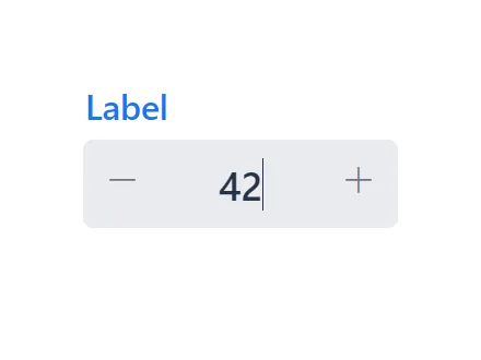
Number Field sports many of the same features as Text Field but only accepts numeric input. See Number Field
Radio Button
Radio Button Group allows the user to select exactly one value from a list of related but mutually exclusive options. See Radio Button
Select
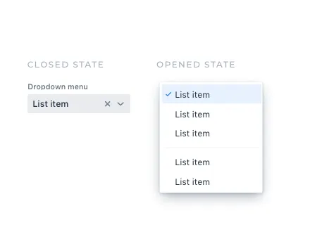
Select allows users to choose a single value from a list of options presented in an overlay. See Select

Time Picker
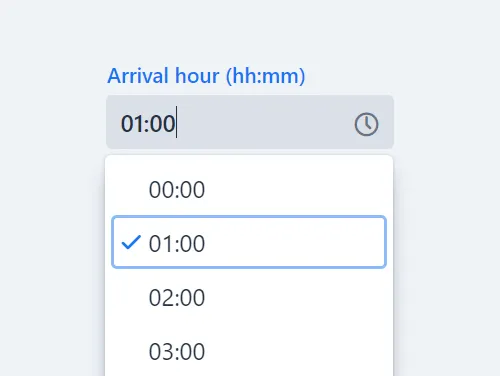
Time Picker is an input field for entering or selecting a specific time. See Time Picker
Visualization & Interaction
Avatar
Avatar is a graphical representation of an object or entity, for example a person or an organisation. See Avatar
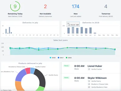
Charts
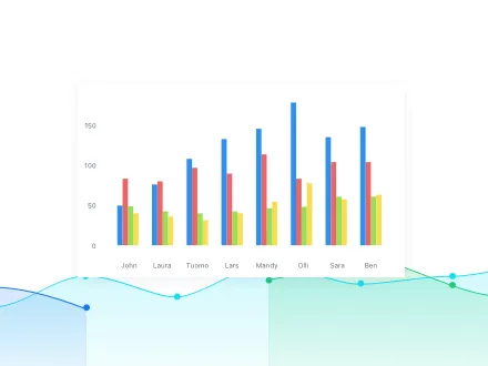
Feature-rich interactive graph library that answers the data visualization needs of modern web applications. See Charts
CRUD
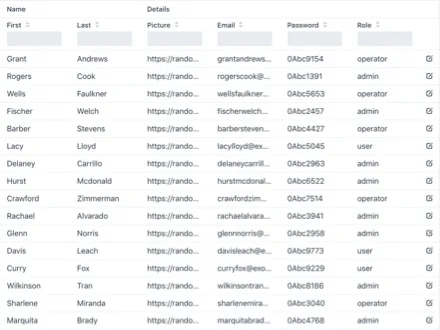
CRUD is a component for managing a dataset. It allows for easy displaying, editing, creating, and deleting of items. See CRUD
Context Menu
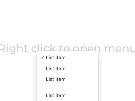
Context Menu is a component that you can attach to any component to display a context menu. See Context Menu
Cookie Consent

Cookie Consent aims to help you comply with privacy laws such as GDPR and CCPA. See Cookie Consent
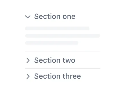
Details

The Details component is an expandable panel for showing and hiding content from the user to make the UI less crowded. See Details
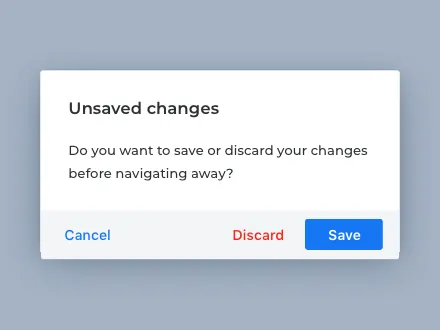
Dialog
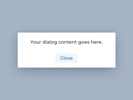
Dialog is a small window that can be used to present information and user interface elements in an overlay. See Dialog
Grid Pro
Grid Pro is an extension of the Grid component that provides inline editing with full keyboard navigation. See Grid Pro
Message List

Message List allows you to show a list of messages, for example, a chat log. See Message List

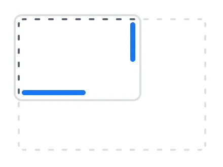
Tabs
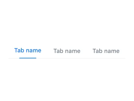
Tabs are used to organize and group content into sections that the user can navigate between. See Tabs
Layouts
Basic Layouts
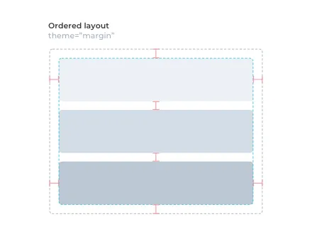
Vaadin features two basic layout components: Vertical Layout and Horizontal Layout. See Basic Layouts
Form Layout
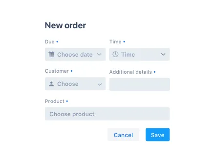
Form Layout allows you to build responsive forms with multiple columns and to position input labels on top or to the side of the input. See Form Layout
Login
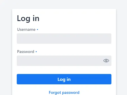
Login is a component that contains a login form. You can use it for authenticating the user with a username and password. See Login
Split Layout
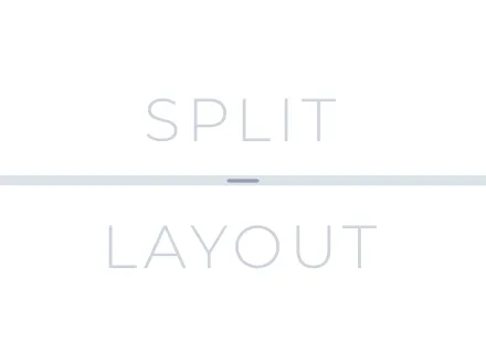
Split Layout is a component with two content areas and a draggable split handle between them. See Split Layout