Lumo Variants
The Lumo theme comes with two color variants: light, which is the default; and dark. It also includes a compact preset that can be applied simultaneously with the color variants. These are essentially predefined customizations of Lumo’s style properties.
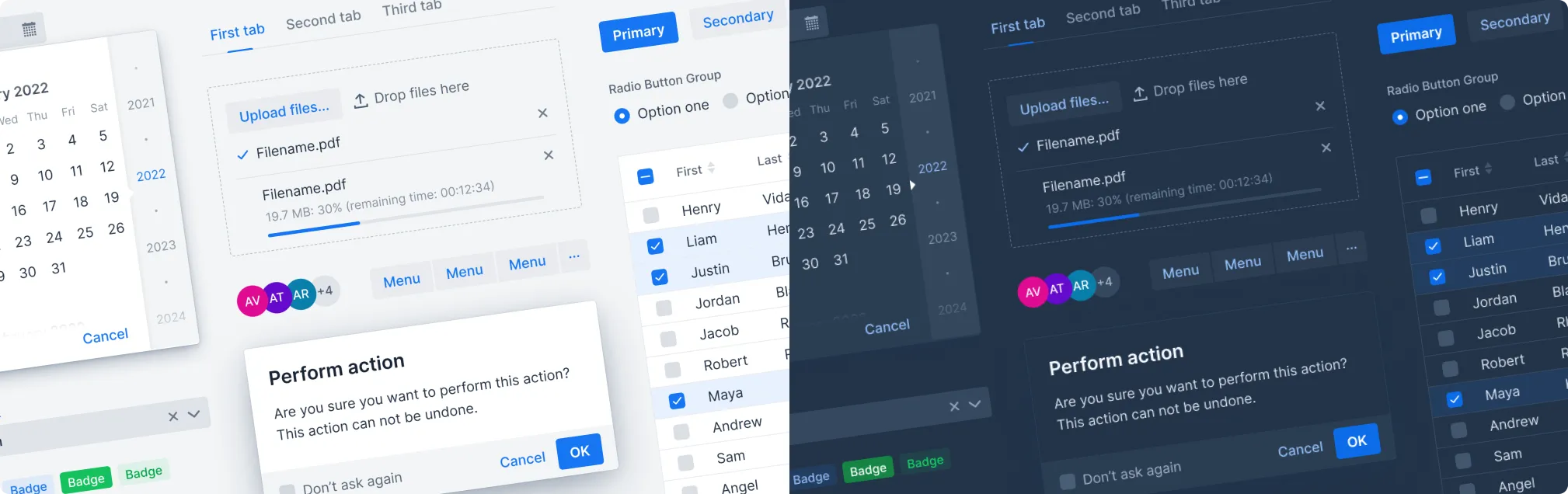
Light & Dark Variants
In the screenshot here, you can see the difference between the default light color variant on the left, and the dark variant on the right — which are both built into Lumo.
The dark variant can be applied statically to the entire UI. In Flow, this can be done by using the
@Theme annotation on the class that implements the AppShellConfigurator interface. In Hilla, the
same can be achieved by setting the theme attribute on the root <html> element:
Source code
Java
@Theme(variant = Lumo.DARK)
public class Application extends implements AppShellConfigurator {
  ...
}
TypeScript
You can customize the colors for the dark theme variant. See Lumo Colors for details.
The variant can be restricted to certain parts of the UI, including individual components. In
Flow, this can be done through the ThemeList or Element API, depending on the component.
Source code
tsx
<VerticalLayout {...{ theme: 'dark' }}></VerticalLayout>

<div {...{ theme: 'dark' }}></div>
tsx
HTML
HTML
Java
Java
In addition to applying the dark variant statically, applications can allow the user to switch dynamically between the light and dark variants. This is done in Flow by applying them to the UI class.
Source code
tsx
<Button
  onClick={() => {
    const root = document.documentElement;
    if (root.getAttribute('theme') === 'dark') {
      root.removeAttribute('theme');
    } else {
      root.setAttribute('theme', 'dark');
    }
  }}
>
  Toggle theme variant
</Button>
tsx
ts
ts
Java
Java
The dark variant can also be applied automatically based on the operating system’s light and dark mode setting. It’s exposed to the browser through the prefers-color-scheme CSS feature.
Compact Preset
Lumo also has a compact preset that reduces fonts sizes — and proportionally all Vaadin components. It’s applied by loading an additional JavaScript module containing a modified set of Lumo sizing properties:
Source code
Java
@JsModule("@vaadin/vaadin-lumo-styles/presets/compact.js")
public class MainLayout extends VerticalLayout {
  ...
}
TypeScript
6edf45a5-74c9-4775-a0ad-48d822264ffe